flex-direction 排列方向
弹性和模型中内部的子元素的排列方向可以通过这个属性修改,那么我们就一起看下它的使用吧。
1. 官方定义
flex-direction 属性规定项目的排列方向。
2. 慕课解释
flex-direction 用来调整主轴的方向,我们知道主轴默认是水平方向且从左到右,而我们可以通过这个属性设置主轴的方向,即项目是水平方向从左到右还是垂直方向从上到下或者从下到上排列。
3. 语法
div{
    flex-direction: row|row-reverse|column|column-reverse|initial|inherit;
}
<div class="demo">
    <div class="item">1</div>
    <div class="item">2</div>
    <div class="item">3</div>
</div>
.demo{
    display:flex; // 让容器变成弹性盒
    flex-direction:row-reverse; 改变项目的排列方向
}
4. 兼容性
| IE | Edge | Firefox | Chrome | Safari | Opera | ios | android |
|---|---|---|---|---|---|---|---|
| 10+ | 12+ | 28+ | 4+ | 6.1+ | 12.1+ | 7+ | 4.4 |
5. 实例
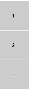
- 让子元素从上到下垂直方向排列
.demo{
    display:flex;
    flex-direction:column;
    text-align: center;
    line-height: 100px;
}
.item{
    background:#ccc;
    height:100px;
    border-bottom:1px solid #fff;
}
效果图
实例演示
预览
复制
<!DOCTYPE html>
<html lang="en">
<head>
    <meta charset="UTF-8">
    <meta name="viewport" content="width=device-width, initial-scale=1.0">
    <title>Document</title>
    <style>
        .demo{
            display:flex;
            flex-direction:column;
            text-align: center;
            line-height: 100px;
        }
        .item{
            background:#ccc;
            height:100px;
            border-bottom:1px solid #fff;
        }
    </style>
</head>
<body>
    <div class="demo">
        <div class="item">1</div>
        <div class="item">2</div>
        <div class="item">3</div>
    </div>
</body>
</html>
运行案例
点击 "运行案例" 可查看在线运行效果
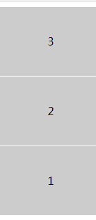
- 让子元素从下到上反向排列
.demo{
    display:flex;
    flex-direction:column-reverse;
    text-align: center;
    line-height: 100px;
}
.item{
    background:#ccc;
    height:100px;
    border-bottom:1px solid #fff;
}
效果图
实例演示
预览
复制
<!DOCTYPE html>
<html lang="en">
<head>
    <meta charset="UTF-8">
    <meta name="viewport" content="width=device-width, initial-scale=1.0">
    <title>Document</title>
    <style>
        .demo{
            display:flex;
            flex-direction:column-reverse;
            text-align: center;
            line-height: 100px;
        }
        .item{
            background:#ccc;
            height:100px;
            border-bottom:1px solid #fff;
        }
    </style>
</head>
<body>
    <div class="demo">
        <div class="item">1</div>
        <div class="item">2</div>
        <div class="item">3</div>
    </div>
</body>
</html>
运行案例
点击 "运行案例" 可查看在线运行效果
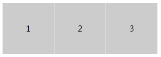
- 让子元素从左到右排列
.demo{
    display:flex;
    flex-direction:row;
}
.item{
    background:#ccc;
    height:100px;
    width: 100px;
    border-right:1px solid #fff;
}
效果图
实例演示
预览
复制
<!DOCTYPE html>
<html lang="en">
<head>
    <meta charset="UTF-8">
    <meta name="viewport" content="width=device-width, initial-scale=1.0">
    <title>Document</title>
    <style>
        .demo{
            display:flex;
            flex-direction:row;
            text-align: center;
            line-height: 100px;
        }
        .item{
            background:#ccc;
            height:100px;
            width: 100px;
            border-right:1px solid #fff;
        }
    </style>
</head>
<body>
    <div class="demo">
        <div class="item">1</div>
        <div class="item">2</div>
        <div class="item">3</div>
    </div>
</body>
</html>
运行案例
点击 "运行案例" 可查看在线运行效果
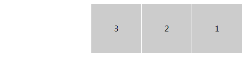
- 让子元素从左到右反向排列
.demo{
    display:flex;
    flex-direction:row-reverse;
}
.item{
    background:#ccc;
    height:100px;
    width: 100px;
    border-right:1px solid #fff;
}
效果图
实例演示
预览
复制
<!DOCTYPE html>
<html lang="en">
<head>
    <meta charset="UTF-8">
    <meta name="viewport" content="width=device-width, initial-scale=1.0">
    <title>Document</title>
    <style>
        .demo{
            display:flex;
            flex-direction:row-reverse;
            text-align: center;
            line-height: 100px;
        }
        .item{
            background:#ccc;
            height:100px;
            width: 100px;
            border-right:1px solid #fff;
        }
    </style>
</head>
<body>
    <div class="demo">
        <div class="item">1</div>
        <div class="item">2</div>
        <div class="item">3</div>
    </div>
</body>
</html>
运行案例
点击 "运行案例" 可查看在线运行效果
6. 经验分享
通过 flex 可以做一个上下固定,中间自适应的布局,它常常用于登录页那类的布局设置。
<div class="demo">
    <div class="head">头部</div>
    <div class="content">内容</div>
    <div class="foot">尾部</div>
</div>
html,body{
    padding:0;
    margin:0;
    height: 100%;
    color:#fff;
}
.demo{
    height: 100%;
    display: flex;
    flex-direction: column;
}
.head,.foot{

    flex:0 1 100px;
    background: #000;
}
.content{
    flex: 1;
    background: red;
}
案例:
实例演示
预览
复制
<!DOCTYPE html>
<html lang="en">
<head>
    <meta charset="UTF-8">
    <meta name="viewport" content="width=device-width, initial-scale=1.0">
    <meta http-equiv="X-UA-Compatible" content="ie=edge">
    <title>demo</title>
    <style>
    html,body{
        padding:0;
        margin:0;
        height: 100%;
        color:#fff;
    }
    .demo{
        height: 100%;
        display: flex;
        flex-direction: column;
    }
    .head,.foot{

        flex:0 1 100px;
        background: #000;
    }
    .content{
        flex: 1;
        background: red;
    }
    </style>
</head>
<body>
<div class="demo">
    <div class="head">头部</div>
    <div class="content">内容</div>
    <div class="foot">尾部</div>
</div>
</body>
</html>
运行案例
点击 "运行案例" 可查看在线运行效果
说明:这个布局就是两端固定,中间自适应的典型写法,而如果设置 flex-direction:row就变成了左右固定,中间自适应的横向布局。而他们正是组成页面的基础。
7. 小结
- 一定要在弹性盒模型下使用。
- 可以通过样式直接设置排列顺序,节省浏览器性能。
简介
CSS3简介
盒模型
border 边框
borderImage 边框图片
border-radius 圆角
box-shadow 阴影
box-sizing 盒类型
颜色渐变
gradients 渐变
文字处理
text-justify 对齐
text-overflow 文字超出
text-shadow 文本阴影
文字排版
word-break 文本打断
word-wrap 文本换行
letter-spacing 字间距
空间转换2D和3D
perspective 透视
transform 2D 空间转换
transform 3D 空间转换
过渡和动画
transition 过渡
animation 动画
排版布局
columns 字符分割
flex 弹性盒子布局
flex order 顺序
flex: grow、shrink、basis
flex-direction 排列方向
flex-wrap 换行
justify-content (轴内)对齐方式
align-items 竖直方向对齐方式
align-content
Grid 布局简介
Grid 行和列
媒体查询
media 媒体查询
伪类
only 元素选择
before && after 位置
nth 类型元素选择器
计算函数
calc 计算属性
代码预览
退出