nth 元素选择
当我们要一组 class 同名,或者连续的一组元素的其中一个,或者某种规律的元素添加单独样式的时候,不妨看看这类的元素选择器。
1. 官方定义
nth-child(n)选择器匹配属于其父元素的第 N 个子元素;nth-last-child(n)选择器匹配属于其元素的第 N 个子元素的每个元素,从最后一个子元素开始计数;nth-of-type(n)选择器匹配属于父元素的特定类型的第 N 个子元素的每个元素。
2. 慕课解释
nth-child(n)、 nth-last-child(n) 、nth-of-type(n) 都是用来匹配父元素内部子元素的。不过也有些区别:
nth-child 按照个数来算;
nth-of-type 按照类型来计算;
nth-last-child(n) 从最后一个子元素往前开始计算。
3. 语法
.item:nth-child(2n+1){

}
.item:nth-of-type(n){

}
.item:nth-last-child(2n){

}

n 从 0 开始计数的正整数。
4. 兼容性
| IE | Edge | Firefox | Chrome | Safari | Opera | ios | android |
|---|---|---|---|---|---|---|---|
| all | all | all | all | all | all | all | all |
5. 实例
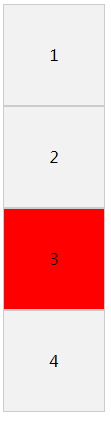
选择 demo 内第 3 个子元素背景为红色。
- 使用
nth-child。
.item{
    width: 100px;
    height: 100px;
    text-align: center;
    line-height: 100px;
    border: 1px solid #ccc;
    background: #f2f2f2;
}
.item:nth-child(3){
    background: red;
}
效果图:
实例演示
预览
复制
<!DOCTYPE html>
<html lang="en">
<head>
    <meta charset="UTF-8">
    <meta name="viewport" content="width=device-width, initial-scale=1.0">
    <title>Document</title>
    <style>
        .item{
            width: 100px;
            height: 100px;
            text-align: center;
            line-height: 100px;
            border: 1px solid #ccc;
            background: #f2f2f2;
        }
        .item:nth-child(3){
            background: red;
        }
    </style>
</head>
<body>
    <div class="demo">
        <div class="item">1</div>
        <div class="item">2</div>
        <div class="item">3</div>
        <div class="item">4</div>
    </div>
</body>
</html>
运行案例
点击 "运行案例" 可查看在线运行效果
- 使用
nth-last-child。
.item{
    width: 100px;
    height: 100px;
    text-align: center;
    line-height: 100px;
    border: 1px solid #ccc;
    background: #f2f2f2;
}
.item:nth-last-child(2){
    background: red;
}
效果图
实例演示
预览
复制
<!DOCTYPE html>
<html lang="en">
<head>
    <meta charset="UTF-8">
    <meta name="viewport" content="width=device-width, initial-scale=1.0">
    <title>Document</title>
    <style>
        .item{
            width: 100px;
            height: 100px;
            text-align: center;
            line-height: 100px;
            border: 1px solid #ccc;
            background: #f2f2f2;
        }
        .item:nth-last-child(2){
            background: red;
        }
    </style>
</head>
<body>
    <div class="demo">
        <div class="item">1</div>
        <div class="item">2</div>
        <div class="item">3</div>
        <div class="item">4</div>
    </div>
</body>
</html>
运行案例
点击 "运行案例" 可查看在线运行效果
- 使用
nth-of-type。
.item{
    width: 100px;
    height: 100px;
    text-align: center;
    line-height: 100px;
    border: 1px solid #ccc;
    background: #f2f2f2;
}
.item:nth-of-type(3){
    background: red;
}
效果图
实例演示
预览
复制
<!DOCTYPE html>
<html lang="en">
<head>
    <meta charset="UTF-8">
    <meta name="viewport" content="width=device-width, initial-scale=1.0">
    <title>Document</title>
    <style>
        .item{
            width: 100px;
            height: 100px;
            text-align: center;
            line-height: 100px;
            border: 1px solid #ccc;
            background: #f2f2f2;
        }
        .item:nth-of-type(3){
            background: red;
        }
    </style>
</head>
<body>
    <div class="demo">
        <div class="item">1</div>
        <div class="item">2</div>
        <div class="item">3</div>
        <div class="item">4</div>
    </div>
</body>
</html>
运行案例
点击 "运行案例" 可查看在线运行效果
6. 经验分享
- 在实例中我们看到
nth-of-type和nth-child同样都使用的是 (3), 那么它们的不同是什么呢?下面这个例子我们一起看下:
<div class="demo">
    <p class="item">我是 p 标签</p>
    <div class="item">1</div>
    <div class="item">2</div>
    <div class="item">3</div>
    <div class="item">4</div>
</div>
<div class="demo">
    <p class="item-2">我是 p 标签</p>
    <div class="item-2">1</div>
    <div class="item-2">2</div>
    <div class="item-2">3</div>
    <div class="item-2">4</div>
</div>
   .demo{
           float: left;
       }
       .item,.item-2{
           width: 100px;
           height: 100px;
           text-align: center;
           line-height: 100px;
           border: 1px solid #ccc;
           background: #f2f2f2;
       }
       .item:nth-of-type(3){
           background: red;
       }
       .item-2:nth-child(3){
           background: red;
       }
效果图
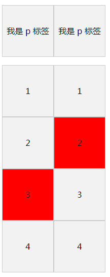
通过效果图我们就清楚的明白他们的差异了。
简述实例展现效果,通过实例分析他们两个的区别
实例演示
预览
复制
<!DOCTYPE html>
<html lang="en">
<head>
    <meta charset="UTF-8">
    <meta name="viewport" content="width=device-width, initial-scale=1.0">
    <title>Document</title>
    <style>
        .demo{
            float: left;
        }
        .item,.item-2{
            width: 100px;
            height: 100px;
            text-align: center;
            line-height: 100px;
            border: 1px solid #ccc;
            background: #f2f2f2;
        }
        .item:nth-of-type(3){
            background: red;
        }
        .item-2:nth-child(3){
            background: red;
        }
    </style>
</head>
<body>
    <div class="demo">
        <p class="item">我是 p 标签</p>
        <div class="item">1</div>
        <div class="item">2</div>
        <div class="item">3</div>
        <div class="item">4</div>
    </div>
    <div class="demo">
        <p class="item-2">我是 p 标签</p>
        <div class="item-2">1</div>
        <div class="item-2">2</div>
        <div class="item-2">3</div>
        <div class="item-2">4</div>
    </div>
</body>
</html>
运行案例
点击 "运行案例" 可查看在线运行效果
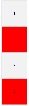
下面是让所有偶数的背景变红。
 .item{
            width: 100px;
            height: 100px;
            text-align: center;
            line-height: 100px;
            border: 1px solid #ccc;
            background: #f2f2f2;
        }
        .item:nth-of-type(2n){
            background: red;
        }
效果图:
实例演示
预览
复制
<!DOCTYPE html>
<html lang="en">
<head>
    <meta charset="UTF-8">
    <meta name="viewport" content="width=device-width, initial-scale=1.0">
    <title>Document</title>
    <style>
        .item{
            width: 100px;
            height: 100px;
            text-align: center;
            line-height: 100px;
            border: 1px solid #ccc;
            background: #f2f2f2;
        }
        .item:nth-of-type(2n){
            background: red;
        }
    </style>
</head>
<body>
    <div class="demo">
        <div class="item">1</div>
        <div class="item">2</div>
        <div class="item">3</div>
        <div class="item">4</div>
    </div>
</body>
</html>
运行案例
点击 "运行案例" 可查看在线运行效果
- 使用
nth-of-type(3n+1)起作用,而nth-of-type(1+3n)不起作用,所以n一定要放在最前面。
简介
CSS3简介
盒模型
border 边框
borderImage 边框图片
border-radius 圆角
box-shadow 阴影
box-sizing 盒类型
颜色渐变
gradients 渐变
文字处理
text-justify 对齐
text-overflow 文字超出
text-shadow 文本阴影
文字排版
word-break 文本打断
word-wrap 文本换行
letter-spacing 字间距
空间转换2D和3D
perspective 透视
transform 2D 空间转换
transform 3D 空间转换
过渡和动画
transition 过渡
animation 动画
排版布局
columns 字符分割
flex 弹性盒子布局
flex order 顺序
flex: grow、shrink、basis
flex-direction 排列方向
flex-wrap 换行
justify-content (轴内)对齐方式
align-items 竖直方向对齐方式
align-content
Grid 布局简介
Grid 行和列
媒体查询
media 媒体查询
伪类
only 元素选择
before && after 位置
nth 类型元素选择器
计算函数
calc 计算属性
代码预览
退出