flex-wrap 换行
flex-wrap 主要通过在外层容器中设置它里面的子项目是否可以换行。默认情况下项目是不换行的。
1. 官方定义
flex-wrap 属性规定flex容器是单行或者多行,同时横轴的方向决定了新行堆叠的方向。
2. 慕课解释
默认情况下,设置了 display:flex 的容器是不会换行的,这时候如果我们希望它换行就可以通过 flex-wrap设置超出宽度换行,也可以设置它如何换行,既换行之后的排列的方向。
3. 语法
flex-wrap: nowrap|wrap|wrap-reverse|initial|inherit;
属性值
| 值 | 描述 |
|---|---|
| nowrap | 默认值。规定灵活的项目不拆行或不拆列。 |
| wrap | 规定灵活的项目在必要的时候拆行或拆列。 |
| wrap-reverse | 规定灵活的项目在必要的时候拆行或拆列,但是以相反的顺序。 |
| initial | 设置该属性为它的默认值。请参阅 initial。 |
| inherit | 从父元素继承该属性。请参阅 inherit。 |
4. 兼容性
| IE | Edge | Firefox | Chrome | Safari | Opera | ios | android |
|---|---|---|---|---|---|---|---|
| 10+ | 12+ | 28+ | 4+ | 6.1+ | 12.1+ | 7+ | 4.4 |
5. 实例
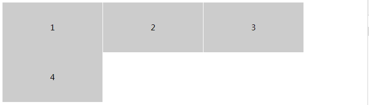
- 设置一个容器,当内部的内容超过容器的宽度时候向下换行。
.demo{
    display: flex;
    flex-wrap: wrap;
}
.item{
    width: 200px;
    height: 100px;
    line-height: 100px;
    background: #ccc;
    border-right: 1px solid #fff;
    text-align: center;
}
效果图
实例演示
预览
复制
<!DOCTYPE html>
<html lang="en">
<head>
    <meta charset="UTF-8">
    <meta name="viewport" content="width=device-width, initial-scale=1.0">
    <title>Document</title>
    <style>

        .demo{
            display: flex;
            flex-wrap: wrap;
        }
        .item{
            width: 200px;
            height: 100px;
            line-height: 100px;
            background: #ccc;
            border-right: 1px solid #fff;
            text-align: center;
        }
    </style>
</head>
<body>
    <div class="demo">
        <div class="item">1</div>
        <div class="item">2</div>
        <div class="item">3</div>
        <div class="item">4</div>
    </div>
</body>
</html>
运行案例
点击 "运行案例" 可查看在线运行效果
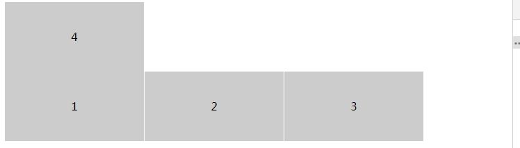
- 设置一个容器当内部的项目超过容器的宽度时候反向向下换行。
.demo{
    display: flex;
    flex-wrap:  wrap-reverse;
}
.item{
    width: 200px;
    height: 100px;
    line-height: 100px;
    background: #ccc;
    border-right: 1px solid #fff;
    text-align: center;
}
效果图
实例演示
预览
复制
<!DOCTYPE html>
<html lang="en">
<head>
    <meta charset="UTF-8">
    <meta name="viewport" content="width=device-width, initial-scale=1.0">
    <title>Document</title>
    <style>

        .demo{
            display: flex;
            flex-wrap: wrap-reverse;
        }
        .item{
            width: 200px;
            height: 100px;
            line-height: 100px;
            background: #ccc;
            border-right: 1px solid #fff;
            text-align: center;
        }
    </style>
</head>
<body>
    <div class="demo">
        <div class="item">1</div>
        <div class="item">2</div>
        <div class="item">3</div>
        <div class="item">4</div>
    </div>
</body>
</html>
运行案例
点击 "运行案例" 可查看在线运行效果
6. 小结
flex 弹性盒模型默认是不换行的既 nowrap
简介
CSS3简介
盒模型
border 边框
borderImage 边框图片
border-radius 圆角
box-shadow 阴影
box-sizing 盒类型
颜色渐变
gradients 渐变
文字处理
text-justify 对齐
text-overflow 文字超出
text-shadow 文本阴影
文字排版
word-break 文本打断
word-wrap 文本换行
letter-spacing 字间距
空间转换2D和3D
perspective 透视
transform 2D 空间转换
transform 3D 空间转换
过渡和动画
transition 过渡
animation 动画
排版布局
columns 字符分割
flex 弹性盒子布局
flex order 顺序
flex: grow、shrink、basis
flex-direction 排列方向
flex-wrap 换行
justify-content (轴内)对齐方式
align-items 竖直方向对齐方式
align-content
Grid 布局简介
Grid 行和列
媒体查询
media 媒体查询
伪类
only 元素选择
before && after 位置
nth 类型元素选择器
计算函数
calc 计算属性
代码预览
退出