-

- qq_點綴灬_0 2022-10-18
width、height 浏览器可视宽、高
device-width、device-height设备屏幕显示宽、高

- 0赞 · 0采集
-

- 终极至尊之主 2022-07-25

针对获取的屏幕宽度,对盒子的宽度进行百分比设置,一行显示n个的效果的具体数值为100/n %
- 0赞 · 0采集
-

- dell_ling 2022-03-13
<!DOCTYPE html>
<html lang="en">
<head>
<meta charset="UTF-8">
<style>
#div0 {
width:100%;
}
#div0 div {
float:left;
height:200px;
}
/*1行三个div*/
@media screen and (min-device-width: 700px) {
#div div{
width:33.3%;
}
#div0 div:nth-child(1) {
background-color:red;
}
#div0 div:nth-child(2) {
background-color:blue;
}
#div0 div:nth-child(3) {
background-color:green;
}
}
/*2行三个div*/
@media screen and (min-device-width: 700px) and (max-device-width:500px) {
#div div{
width:50%;
}
#div0 div:nth-child(1) {
background-color:red;
}
#div0 div:nth-child(2) {
background-color:blue;
}
#div0 div:nth-child(3) {
background-color:green;
}
}
/*3行三个div*/
@media screen and (min-device-width: 200px) and (max-device-width:500px) {
#div div{
width:100%;
}
#div0 div:nth-child(1) {
background-color:red;
}
#div0 div:nth-child(2) {
background-color:blue;
}
#div0 div:nth-child(3) {
background-color:green;
}
}
</style>
</head>
<body>
<div id="div0">
<div></div>
<div></div>
<div></div>
</div>
</body>
- 0赞 · 0采集
-

- 啥子也 2022-02-28
媒体查询@media常用参数:
width\height 通常使用与PC端浏览器窗口改变
device-width\height 通常使用与移动端
- 0赞 · 0采集
-

- weixin_慕用6334942 2021-05-15
移动端device-width
web端width
div:nth-child(0)
- 0赞 · 0采集
-

- 人心思动 2021-03-29
媒体查询的参数
-
截图0赞 · 0采集
-

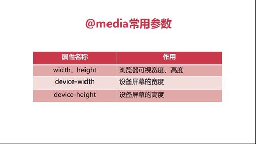
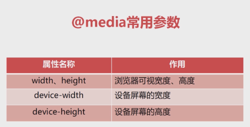
- qq_零之执行人_0 2020-11-30
@media常用参数
width、height:浏览器可视宽度、高度
device-width:设备屏幕的宽度
device-height:设备屏幕的高度
-
截图0赞 · 0采集
-

- weixin_慕数据2289057 2020-11-27
@media常用参数:width.height:浏览器可视宽度高度
device-width:设备屏幕的宽度;(适用移动端)
device-height:设备屏幕的高度;(适用移动端)
@media screen and (min-width:300px) and (max-width:500px)
*and两边要有空格*
float:left:左浮动 ;float:浮动;left:左
#div0 div:nth-child(1):ID为父级是div0的第一个子级
- 0赞 · 0采集
-

- 旅行的癞蛤蟆 2020-11-21
width、height 是浏览器的可视宽度、高度
device-width是设备的屏幕宽度
device-height是设备的屏幕高度
- 0赞 · 0采集
-

- 农民工024 2020-11-18
media 常用参数
-
截图0赞 · 0采集
-

- qq_c_193 2020-10-28
@media常用参数
width,height 浏览器可视宽度,高度
device-width 设备屏幕的宽度
device-height 设备屏幕的高度
- 0赞 · 0采集
-

- 慕工程1764447 2020-10-20
浏览器媒体查询
@media screen and (min-width: 500px) and (max-width: 700px)
-
截图0赞 · 0采集
-

- 慕仙8296047 2020-10-18
- 11111
- 0赞 · 0采集


