-

- 一身喧哗 2024-01-09

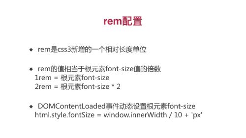
document.addEventListener('DOMContentLoaded', () => {
const html = document.querySelector('html')
let fontSize = window.innerWidth / 10
fontSize = fontSize > 50 ? 50 : fontSize
html.style.fontSize = fontSize + 'px'
})
- 0赞 · 0采集
-

- 沙澧情缘 2022-11-27
rem
- 0赞 · 0采集
-

- 慕用1583038 2022-04-07
根据宽度动态设置字体大小
- 0赞 · 0采集
-

- 慕无忌8554725 2022-03-24
rem配置
- 0赞 · 0采集
-

- chris_xiao 2021-09-26
rem 配置
document.addEventLister('DOMContentLoaded',()=>{
const html=document.querrySelector('html')
let fontSize=window.innerWidth/10
fontSize=fontSize>50?50:fontSize
html.style.fontSize=window.innnerWidth/10+'px'
})- 0赞 · 0采集
-

- gongwanyi 2019-12-19
rem配置
-
截图0赞 · 0采集
-

- 慕粉3119754 2019-09-23
script中直接设置字体大小
-
截图0赞 · 0采集
-

- owlism 2019-09-01
window.innerWidth和window.outterWidth在移动端是没有区别的,都是指屏幕宽度;而在PC端,window.innerWidth指的是页面内容区域的宽度,不包含控制台部分的区域,而window.outterWidth代表的是窗口的宽度
- 1赞 · 0采集
-
- owlism 2019-09-01
用DOMContentLoaded事件绑定在document对象上,当页面的dom元素加载后,这个事件就会触发
-
截图0赞 · 0采集
-
- owlism 2019-09-01
rem配置,在dom加载完毕时,设置html标签的字体大小
-
截图0赞 · 0采集
-

- 爱学习前端一枚 2019-07-24
- 设置rem
-
截图0赞 · 0采集
-

- 慕沐0269658 2019-07-06
rem配置
-
截图0赞 · 0采集
-

- 霜花似雪 2019-05-22
rem配置
-
截图0赞 · 1采集
-

- 淡水狗 2019-05-07
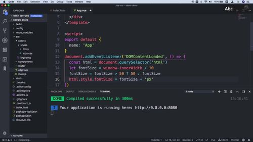
rem配置,字体随屏幕大小自适应。在App.vue中添加
document.addEventListener("DOMContentLoaded", setFontSize);
window.addEventListener('resize', setFontSize)
function setFontSize() {
const html = document.querySelector("html");
let fontSize = window.innerWidth / 10;
fontSize = fontSize > 50 ? 50 : fontSize;
html.style.fontSize = fontSize + "px";
}
- 0赞 · 0采集
-

- hz_北回归线的薰衣草123 2019-04-02
Rem根元素的设置
- 0赞 · 0采集
-

- 顾一行 2018-11-19
DOMContentLoaded事件动态设置根元素font-size
html.style.fontSize = window.innerWidth / 10 + 'px'
- 0赞 · 0采集
-

- 别碰瓷老司机 2018-10-30
fontSize 设置
-
截图0赞 · 0采集
-
- 别碰瓷老司机 2018-10-30
rem 配置
-
截图0赞 · 0采集
-

- zozo_zuo 2018-08-24
增加动态变化
document.addEventListener("DOMContentLoaded", setFontSize);
window.addEventListener('resize', setFontSize)
function setFontSize() {
const html = document.querySelector("html");
let fontSize = window.innerWidth / 10;
fontSize = fontSize > 50 ? 50 : fontSize;
html.style.fontSize = fontSize + "px";
}
- 2赞 · 2采集
-
- zozo_zuo 2018-08-24
1rem = 根元素font-size
-
截图0赞 · 0采集
-

- 小武同学诶 2018-08-23
- 啊咯KKK
-
截图0赞 · 0采集


