双飞翼布局和圣杯布局其实是一样的,只不过在写法上有些不同,其布局都是左右固定宽度,中间宽度自适应。
圣杯布局
html结构
<div class="article">
    <div class="center">center</div>
    <div class="left">left</div>
    <div class="right">right</div></div>
css
先写出大概的样式
.article{    height: 300px;    padding: 0 200px;
}.article .left{    width: 200px;    height: 100px;    background: blue;    float: left;
}.article .right{    width: 200px;    background: #ccc;    height: 100px;    float: right;
}.article .center{    background: yellow;    width: 100%;    height: 100%;    float: left;
}
现在的布局是这样的
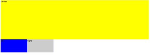
image.png
在.left中添加
margin-left: -100%;
在.right中添加
margin-left: -200px;
布局就变成了
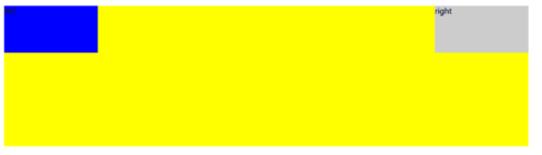
image.png
最后,在.left中添加
position: relative;
left: -100%;
在.right中添加
position: relative;
right: -200px;
大功告成
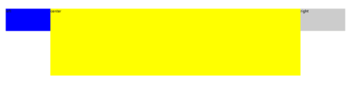
image.png
完整代码
<!DOCTYPE html><html lang="en"><head>
    <meta charset="UTF-8">
    <title>圣杯布局</title>
    <style>
        .article{            height: 300px;            padding: 0 200px;
        }        .article .left{            width: 200px;            height: 100px;            background: blue;            float: left;            position: relative;            left: -200px;            margin-left: -100%;
        }        .article .right{            width: 200px;            background: #ccc;            height: 100px;            float: right;            position: relative;            right: -200px;            margin-left: -100%;
        }        .article .center{            background: yellow;            width: 100%;            height: 100%;            float: left;
        }    </style></head><body>
    <div class="article">
        <div class="center">center</div>
        <div class="left">left</div>
        <div class="right">right</div>
    </div></body></html>
双飞翼布局
双飞翼布局是在圣杯布局基础上改的
html结构改成了
<div class="article">
    <div class="center"><div class="inner">center</div></div>
    <div class="left">left</div>
    <div class="right">right</div></div>
css结构改成了
.article{    height: 300px;    overflow: hidden;
}.article .left{    width: 200px;    height: 100px;    background: blue;    float: left;    /*position: relative;
    left: -200px;*/
    margin-left: -100%;
}.article .right{    width: 200px;    background: #ccc;    height: 100px;    float: left;    /*position: relative;
    right: -200px;*/
    margin-left: -200px;
}.article .center{    background: yellow;    width: 100%;    height: 100%;    float: left;
}.center .inner{    margin-left: 200px;    margin-right: 200px;
}
页面是这样的
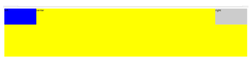
image.png
因为高度不一样所以会显得很难看,要想不固定高度,加上以下代码
.center,.left,.right{    padding-bottom: 9999px;    margin-bottom: -9999px;
}
大功告成
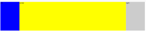
image.png
完整代码
<!DOCTYPE html><html lang="en"><head>
    <meta charset="UTF-8">
    <title>双飞翼布局</title>
    <style>
        .article{            height: 300px;            overflow: hidden;
        }        .article .left{            width: 200px;            height: 100px;            background: blue;            float: left;            /*position: relative;
            left: -200px;*/
            margin-left: -100%;
        }        .article .right{            width: 200px;            background: #ccc;            height: 100px;            float: left;            /*position: relative;
            right: -200px;*/
            margin-left: -200px;
        }        .article .center{            background: yellow;            width: 100%;            height: 100%;            float: left;
        }        .center .inner{            margin-left: 200px;            margin-right: 200px;
        }        .center,.left,.right{            padding-bottom: 9999px;            margin-bottom: -9999px;
        }    </style></head><body>
    <div class="article">
        <div class="center"><div class="inner">center</div></div>
        <div class="left">left</div>
        <div class="right">right</div>
    </div></body></html>
作者:我竟无言以对_1202
链接:https://www.jianshu.com/p/cfed3eaa19fa

 随时随地看视频