
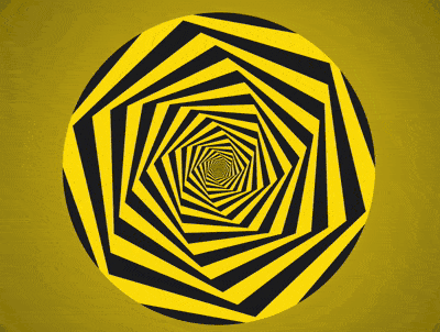
效果预览
按下右侧的“点击预览”按钮可以在当前页面预览,点击链接可以全屏预览。
https://codepen.io/comehope/pen/NBvrWL
可交互视频
此视频是可以交互的,你可以随时暂停视频,编辑视频中的代码。
请用 chrome, safari, edge 打开观看。
https://scrimba.com/p/pEgDAM/czD3PhM
源代码下载
每日前端实战系列的全部源代码请从 github 下载:
https://github.com/comehope/front-end-daily-challenges
代码解读
定义 dom,容器中包含 1 个内含 5 个 <span> 的 <div>:
<div class="container">    <div class="hexagons">
        <span></span>
        <span></span>
        <span></span>
        <span></span>
        <span></span>
    </div></div>
居中显示:
body {    margin: 0;    height: 100vh;    display: flex;    align-items: center;    justify-content: center;    background: radial-gradient(circle at center, gold, black);
}
定义圆形的外层容器的尺寸:
.container {    width: 20em;    height: 20em;    font-size: 20px;    border-radius: 50%;
}
在六边形容器中画出 1 个矩形:
.hexagons {    width: inherit;    height: inherit;    display: flex;    align-items: center;    justify-content: center;
}.hexagons span {    position: absolute;    width: calc(20em / 1.732);    height: inherit;    background-color: currentColor;
}
用伪元素再创建 2 个相同大小的矩形,一起组成一个六边形:
.hexagons span:before,.hexagons span:after {    content: '';    position: absolute;    width: inherit;    height: inherit;    background-color: currentColor;
}.hexagons span:before {    transform: rotate(60deg);
}.hexagons span:after {    transform: rotate(-60deg);
}
让六边形的颜色交错呈现:
.hexagons span:nth-child(odd) {    color: gold;
}.hexagons span:nth-child(even) {    color: #222;
}
设置变量,让六边形逐渐缩小,小六边形重叠在大六边形的上面:
.hexagons span {    transform: scale(var(--scale)) ;
}.hexagons span:nth-child(1) {    --scale: 1;
}.hexagons span:nth-child(2) {    --scale: calc(1 * 0.9);
}.hexagons span:nth-child(3) {    --scale: calc(1 * 0.9 * 0.9);
}.hexagons span:nth-child(4) {    --scale: calc(1 * 0.9 * 0.9 * 0.9);
}.hexagons span:nth-child(5) {    --scale: calc(1 * 0.9 * 0.9 * 0.9 * 0.9);
}
再设置变量,让六边形依次倾斜不同的角度:
.hexagons span {    transform: scale(var(--scale)) rotate(calc(var(--n) * 6deg));
}.hexagons span:nth-child(1) {    --n: 1;
}.hexagons span:nth-child(2) {    --n: 2;
}.hexagons span:nth-child(3) {    --n: 3;
}.hexagons span:nth-child(4) {    --n: 4;
}.hexagons span:nth-child(5) {    --n: 5;
}
定义动画效果:
.hexagons {    animation: twist 0.5s linear infinite;
}

@keyframes twist {    from {        transform: rotate(0deg) scale(1);
    }    to {        transform: rotate(calc(6deg * -2)) scale(1.25);
    }
}
隐藏容器外的内容:
.container {    overflow: hidden;
}
接下来用 d3 来批量创建六边形。
引入 d3 库:
<script src="https://d3js.org/d3.v5.min.js"></script>
用 d3 创建六边形的 dom 元素:
const COUNT = 5;

d3.select('.hexagons')
    .selectAll('span')
    .data(d3.range(COUNT))
    .enter()
    .append('span');
用 d3 为六边形的 --n 和 --scale 变量赋值:
d3.select('.hexagons') .selectAll('span') .data(d3.range(COUNT)) .enter() .append('span') .style('--scale', (d) => Math.pow(0.9, d)) .style('--n', (d) => d + 1);删除掉 html 文件中的六边形 dom 元素,和 css 文件中声明的变量。
最后,把六边形的数量改为 100 个:
const COUNT = 100;
大功告成!
原文链接:https://segmentfault.com/a/1190000015770017
原文作者:comehope

 随时随地看视频