14组CSS3动画特效,来源地址:css图形制作
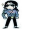
##气泡三角形##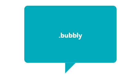
<section id="bubbly" class="code-wrap cf">
      <div class="css-live-wrap">

        <summary>利用 border 的 transparent 特性实现</summary>
        <hgroup class="bubbly">
          <h1>.bubbly</h1>
        </hgroup>
      </div>
      <style>
        .bubbly {
          position: absolute;
          top:50%;
          left: 50%;
          transform:translate(-50%,-50%);
          background: #00aabb;
          border-radius: .4em;
          width: 260px;
          padding: 60px 20px;
          text-align: center;
          color: white;
          font-size: 200%;
        }
        .bubbly:after {
          content: '';
          position: absolute;
          bottom: 0;
          left: 50%;
          border: 34px solid transparent;
          border-top-color: #00aabb;
          border-bottom: 0;
          border-left: 0;
          margin: 0 0 -34px -17px;
        }
      </style>
    </section>
梯形
<section id="trapezoid" class="code-wrap cf">
      <h2>梯形</h2>
      <div class="css-live-wrap">

        <summary>利用伪类加旋转透视实现</summary>
        <hgroup class="trapezoid">
          <h1>.trapezoid</h1>
        </hgroup>
      </div>
      <style>
        .trapezoid{
          position: absolute;
          top:50%;
          left: 50%;
          transform:translate(-50%,-50%);
          width: 160px;
          padding: 60px;
          text-align: center;
          color: white;
          font-size: 200%;
        }
        .trapezoid:before{
          content:"";
          position: absolute;
          top: 0; right: 0; bottom: 0; left: 0;
          transform:perspective(40px) scaleY(1.3) rotateX(5deg);
          transform-origin: bottom;
          background:deeppink;
          z-index:-1;
        }
      </style>
    </section>
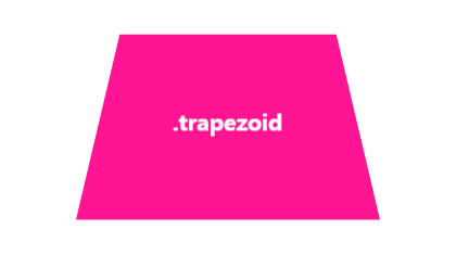
爱心
<div id="heart"></div>
<pre class="brush:css">
#heart {
    position: relative;
    width: 100px;
    height: 90px;
}
#heart:before,
#heart:after {
    position: absolute;
    content: "";
    left: 50px;
    top: 0;
    width: 50px;
    height: 80px;
    background: red;
    -moz-border-radius: 50px 50px 0 0;
    border-radius: 50px 50px 0 0;
    -webkit-transform: rotate(-45deg);
       -moz-transform: rotate(-45deg);
        -ms-transform: rotate(-45deg);
         -o-transform: rotate(-45deg);
            transform: rotate(-45deg);
    -webkit-transform-origin: 0 100%;
       -moz-transform-origin: 0 100%;
        -ms-transform-origin: 0 100%;
         -o-transform-origin: 0 100%;
            transform-origin: 0 100%;
}
#heart:after {
    left: 0;
    -webkit-transform: rotate(45deg);
       -moz-transform: rotate(45deg);
        -ms-transform: rotate(45deg);
         -o-transform: rotate(45deg);
            transform: rotate(45deg);
    -webkit-transform-origin: 100% 100%;
       -moz-transform-origin: 100% 100%;
        -ms-transform-origin: 100% 100%;
         -o-transform-origin: 100% 100%;
            transform-origin :100% 100%;
}
##太极图 ##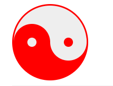
<div id="yin-yang"></div>
<pre class="brush:css">
#yin-yang {
	width: 96px;
	height: 48px;
	background: #eee;
	border-color: red;
	border-style: solid;
	border-width: 2px 2px 50px 2px;
	border-radius: 100%;
	position: relative;
}

#yin-yang:before {
	content: "";
	position: absolute;
	top: 50%;
	left: 0;
	background: #eee;
	border: 18px solid red;
	border-radius: 100%;
	width: 12px;
	height: 12px;
}

#yin-yang:after {
	content: "";
	position: absolute;
	top: 50%;
	left: 50%;
	background: red;
	border: 18px solid #eee;
	border-radius:100%;
	width: 12px;
	height: 12px;
}
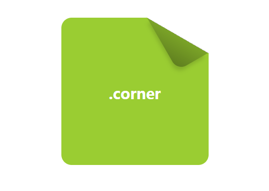
折角
<div class="css-live-wrap">
        <div class="star" title="致敬《CSS SECRET》作者,此实例是书中例子"></div>

        <summary>利用切角、伪类、渐变、旋转实现</summary>
        <hgroup class="corner">
          <h1>.corner</h1>
        </hgroup>
      </div>
      <style>
        .corner{
          position: absolute;
          top:50%;left: 50%;
          transform:translate(-50%,-50%);
          width: 120px;line-height:120px;
          padding:40px;
          text-align: center;
          color: white;
          font-size: 200%;
          background:linear-gradient(-150deg,transparent 1.5em, yellowgreen  0);
          border-radius:.5em;
        }
        .corner:before{
          content: '';
          position: absolute;
          top: 0; right: 0;
          background:
          linear-gradient(to left bottom,transparent 50%, rgba(0,0,0,.2) 0, rgba(0,0,0,.4)) 100% 0 no-repeat;
          width: 1.73em; height: 3em;
          transform: translateY(-1.3em) rotate(-30deg);
          transform-origin: bottom right;
          border-bottom-left-radius: inherit;
          box-shadow: -.2em .2em .3em -.1em rgba(0,0,0,.15);
        }

      </style>
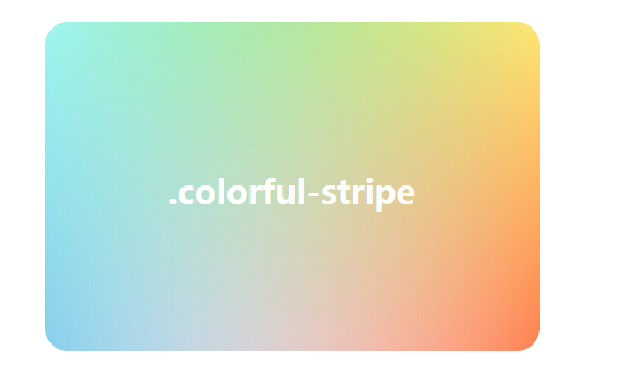
混合模式背景图
<div class="css-live-wrap">

        <summary>利用渐变实现</summary>
        <hgroup class="colorful-stripe">
          <h1>.colorful-stripe</h1>
        </hgroup>
      </div>
      <style>
        .colorful-stripe {
          position: absolute;
          top: 50%;
          left: 50%;
          transform: translate(-50%, -50%);
          width: 300px;
          line-height: 200px;
          text-align: center;
          color: #fff;
          font-size: 200%;
          border-radius: .5em;
          background:
          linear-gradient(limegreen, transparent), linear-gradient(90deg, skyblue, transparent), linear-gradient(-90deg, coral, transparent);
          background-blend-mode: screen;
        }
      </style>
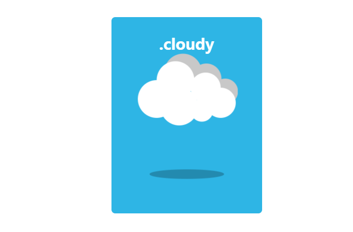
多云
<div class="css-live-wrap">

        <summary>利用线性渐变、阴影、缩放实现</summary>
        <hgroup class="cloudy">
          <h1>.cloudy</h1>
        </hgroup>
      </div>
      <style>
        .cloudy{
          position: absolute;
          top: 50%;left: 50%;
          width:200px;height:260px;
          transform: translate(-50%, -50%);
          text-align:center;
          font-size:200%;
          color:#fff;
          background:#2EB5E5;
          border-radius:5px;
        }
        .cloudy:before {
          content: "";
          text-indent:23px;
          font-size:22px;
          line-height:40px;
          color:#333;
          position: absolute;
          height: 50px;width: 50px;
          background: #FFFFFF;
          left:30%;
          top:45%;
          transform: translate(-50%, -50%);
          border-radius: 50%;
          box-shadow:
            #FFFFFF 65px -15px 0 -5px,
            #FFFFFF 25px -25px,
            #FFFFFF 30px 10px,
            #FFFFFF 60px 15px 0 -10px,
            #FFFFFF 85px 5px 0 -5px,
            #C8C8C8 35px -35px,
            #C8C8C8 66px -27px 0 -5px,
            #C8C8C8 91px -10px 0 -8px;
          animation: cloudy 5s ease-in-out infinite;
        }
        .cloudy:after{
          content:"";
          position: absolute;
          top: 80%;left: 50%;
          height: 15px;
          width: 120px;
          background:rgba(0,0,0,.5);
          border-radius: 50%;
          transform: translate(-50%, -50%);
          animation: cloudy_shadow 5s ease-in-out infinite;
        }
      @keyframes cloudy {
        50%{
          transform: translate(-50%, -70%);
        }
        100%{
          transform: translate(-50%, -50%);
        }
      }
      @keyframes cloudy_shadow {
        50%{
          transform: translate(-50%, -50%) scale(0.8);
          background:rgba(0,0,0,.2);
        }
        100%{
          transform: translate(-50%, -50%) scale(1);
            background:rgba(0,0,0,.5);
        }
      }
      </style>
阴影实现多云天气图案
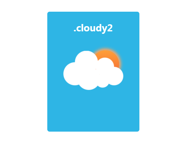
<div class="css-live-wrap">
        <summary>多云(cloudy2)(单标签实现)</summary>
        <summary>利用线性渐变、阴影、缩放实现</summary>
        <hgroup class="cloudy2">
          <h1>.cloudy2</h1>
        </hgroup>
      </div>
      <style>
        .cloudy2{
          position: absolute;
          top: 50%;left: 50%;
          width:200px;height:260px;
          transform: translate(-50%, -50%);
          text-align:center;
          font-size:200%;
          color:#fff;
          background:#2EB5E5;
          border-radius:5px;
        }
        .cloudy2:before {
          content: "";
          text-indent:23px;
          font-size:22px;
          line-height:40px;
          color:#333;
          position: absolute;
          height: 50px;width: 50px;
          background: #FFFFFF;
          left:30%;
          top:55%;
          transform: translate(-50%, -50%);
          border-radius: 50%;
          z-index:100;
          box-shadow:
            #FFFFFF 65px -15px 0 -5px,
            #FFFFFF 25px -25px,
            #FFFFFF 30px 10px,
            #FFFFFF 60px 15px 0 -10px,
            #FFFFFF 85px 5px 0 -5px;
          animation: cloudy2 5s ease-in-out infinite;
        }
        .cloudy2:after{
          content:"";
          position: absolute;
          top: 45%;left: 63%;
          height: 60px;
          width: 60px;
          z-index:10;
          background:linear-gradient(180deg,#FE9F38 0%, #F46635 100%);
          border-radius: 50%;
          transform: translate(-50%, -50%);
          box-shadow: 0 0 10px 4px #FFA563;
          animation: cloudy2 10s ease-in-out infinite;
        }
      @keyframes cloudy2 {
        50%{
          transform: translate(-50%, -70%);
        }
        100%{
          transform: translate(-50%, -50%);
        }
      }
      </style>
阴影实现雨天天气图案
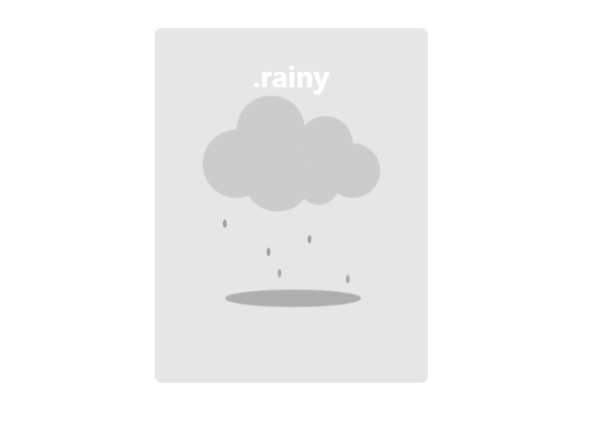
<div class="css-live-wrap">
        <summary>雨(rainy)</summary>
        <summary>利用线性渐变、阴影、缩放实现</summary>
        <hgroup class="rainy-container">
          <h1>.rainy</h1>
          <div class="rainy"></div>
        </hgroup>
      </div>
      <style>
        .rainy-container {
          position: absolute;
          top: 50%;
          left: 50%;
          width: 200px;
          height: 260px;
          transform: translate(-50%, -50%);
          text-align: center;
          font-size: 200%;
          color: #fff;
          background: #E6E6E6;
          border-radius: 5px;
        }
        .rainy {
          position: absolute;
          width: 3px;
          height: 6px;
          top: 30%;
          left: 50%;
          background: #CCCCCC;
          border-radius: 50%;
          animation: rainy_rain .7s infinite linear;
        }
        .rainy:before {
          content: "";
          color: #333;
          position: absolute;
          height: 50px;
          width: 50px;
          top: 30px;
          left: -40px;
          background: #CCC;
          transform: translate(-50%, -50%);
          border-radius: 50%;
          box-shadow: #CCC 65px -15px 0 -5px, #CCC 25px -25px, #CCC 30px 10px, #CCC 60px 15px 0 -10px, #CCC 85px 5px 0 -5px;
          animation: cloudy 5s ease-in-out infinite;
        }
        .rainy:after {
          content: "";
          position: absolute;
          top: 120px;
          left: 50%;
          height: 15px;
          width: 120px;
          background: rgba(0, 0, 0, .5);
          border-radius: 50%;
          transform: translate(-50%, -50%);
          animation: cloudy_shadow 5s ease-in-out infinite;
        }
        @keyframes cloudy {
          50% {
            transform: translate(-50%, -70%);
          }
          100% {
            transform: translate(-50%, -50%);
          }
        }
        @keyframes cloudy_shadow {
          50% {
            transform: translate(-50%, -50%) scale(0.8);
            background: rgba(0, 0, 0, .2);
          }
          100% {
            transform: translate(-50%, -50%) scale(1);
            background: rgba(0, 0, 0, .5);
          }
        }
        @keyframes rainy_rain {
          0% {
            box-shadow: rgba(0, 0, 0, 0) -10px 30px, rgba(0, 0, 0, 0) 40px 40px, rgba(0, 0, 0, .3) -50px 75px, rgba(0, 0, 0, .3) 55px 50px, rgba(0, 0, 0, .3) -18px 100px, rgba(0, 0, 0, .3) 12px 95px, rgba(0, 0, 0, .3) -31px 45px, rgba(0, 0, 0, .3) 30px 35px;
          }
          25% {
            box-shadow: rgba(0, 0, 0, .3) -10px 45px, rgba(0, 0, 0, .3) 40px 60px, rgba(0, 0, 0, .3) -50px 90px, rgba(0, 0, 0, .3) 55px 65px, rgba(0, 0, 0, 0) -18px 120px, rgba(0, 0, 0, 0) 12px 120px, rgba(0, 0, 0, .3) -31px 70px, rgba(0, 0, 0, .3) 30px 60px;
          }
          26% {
            box-shadow: rgba(0, 0, 0, .3) -10px 45px, rgba(0, 0, 0, .3) 40px 60px, rgba(0, 0, 0, .3) -50px 90px, rgba(0, 0, 0, .3) 55px 65px, rgba(0, 0, 0, 0) -18px 40px, rgba(0, 0, 0, 0) 12px 20px, rgba(0, 0, 0, .3) -31px 70px, rgba(0, 0, 0, .3) 30px 60px;
          }
          50% {
            box-shadow: rgba(0, 0, 0, .3) -10px 70px, rgba(0, 0, 0, .3) 40px 80px, rgba(0, 0, 0, 0) -50px 100px, rgba(0, 0, 0, .3) 55px 80px, rgba(0, 0, 0, .3) -18px 60px, rgba(0, 0, 0, .3) 12px 45px, rgba(0, 0, 0, .3) -31px 95px, rgba(0, 0, 0, .3) 30px 85px;
          }
          51% {
            box-shadow: rgba(0, 0, 0, .3) -10px 70px, rgba(0, 0, 0, .3) 40px 80px, rgba(0, 0, 0, 0) -50px 45px, rgba(0, 0, 0, .3) 55px 80px, rgba(0, 0, 0, .3) -18px 60px, rgba(0, 0, 0, .3) 12px 45px, rgba(0, 0, 0, .3) -31px 95px, rgba(0, 0, 0, .3) 30px 85px;
          }
          75% {
            box-shadow: rgba(0, 0, 0, .3) -10px 95px, rgba(0, 0, 0, .3) 40px 100px, rgba(0, 0, 0, .3) -50px 60px, rgba(0, 0, 0, 0) 55px 95px, rgba(0, 0, 0, .3) -18px 80px, rgba(0, 0, 0, .3) 12px 70px, rgba(0, 0, 0, 0) -31px 120px, rgba(0, 0, 0, 0) 30px 110px;
          }
          76% {
            box-shadow: rgba(0, 0, 0, .3) -10px 95px, rgba(0, 0, 0, .3) 40px 100px, rgba(0, 0, 0, .3) -50px 60px, rgba(0, 0, 0, 0) 55px 35px, rgba(0, 0, 0, .3) -18px 80px, rgba(0, 0, 0, .3) 12px 70px, rgba(0, 0, 0, 0) -31px 25px, rgba(0, 0, 0, 0) 30px 15px;
          }
          100% {
            box-shadow: rgba(0, 0, 0, 0) -10px 120px, rgba(0, 0, 0, 0) 40px 120px, rgba(0, 0, 0, .3) -50px 75px, rgba(0, 0, 0, .3) 55px 50px, rgba(0, 0, 0, .3) -18px 100px, rgba(0, 0, 0, .3) 12px 95px, rgba(0, 0, 0, .3) -31px 45px, rgba(0, 0, 0, .3) 30px 35px;
          }
        }
      </style>
彩虹天气图案
<div class="css-live-wrap">
        <summary>彩虹(rainbow)</summary>
        <summary>利用border、box-shadow 实现</summary>
        <hgroup class="rainbow-container">
          <h1>.rainbow</h1>
          <div class="rainbow"></div>
        </hgroup>
      </div>
      <style>
        .rainbow-container{
          position: absolute;
          top: 50%;left: 50%;
          width:200px;height:260px;
          transform: translate(-50%, -50%);
          text-align:center;
          font-size:200%;
          color:#fff;
          background:#F3D166;
          border-radius:5px;
        }
        .rainbow{
          position:absolute;
          top: 50%;
          left: 50%;
          transform: translate(-50%, -50%);
          height: 1px;width: 1px;
        }
        .rainbow:before{
          content:"";
          position:absolute;
          top: 50%;left: 50%;
          transform: translate(-50%, -50%) rotate(45deg);
          height: 70px;width: 70px;
          border-radius: 100px 0 0 0;
          box-shadow:
            #F44336 -2px -2px 0 1px,
            #FF9800 -4px -4px 0 3px,
            #FFEB3B -6px -6px 0 5px,
            #8BC34A -8px -8px 0 7px,
            #00BCD4 -10px -10px 0 9px,
            #2196F3 -12px -12px 0 11px,
            #9C27B0 -14px -14px 0 13px;
          animation: rainbow 5s ease-in-out infinite;
        }
        .rainbow:after{
          content: "";
          position: absolute;
          top: 70px;
          left: 50%;
          height: 15px;
          width: 120px;
          background: rgba(0, 0, 0, .5);
          border-radius: 50%;
          transform: translate(-50%, -50%);
          animation: cloudy_shadow 5s ease-in-out infinite;
        }
        @keyframes rainbow {
          50% {
            transform: translate(-50%, -55%) rotate(30deg);
          }
          100% {
            transform: translate(-50%, -50%) rotate(45deg);
          }
        }
        @keyframes cloudy_shadow {
          50% {
            transform: translate(-50%, -50%) scale(0.8);
            background: rgba(0, 0, 0, .2);
          }
          100% {
            transform: translate(-50%, -50%) scale(1);
            background: rgba(0, 0, 0, .5);
          }
        }
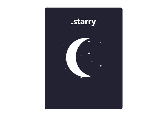
雪天天气图案
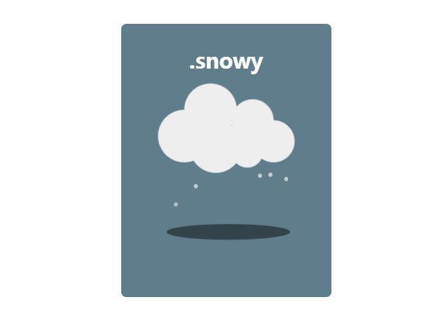
<div class="css-live-wrap">
        <summary>雪(snowy)</summary>
        <summary>利用阴影实现</summary>
        <hgroup class="snowy-container">
          <h1>.snowy</h1>
          <div class="snowy"></div>
        </hgroup>
      </div>
      <style>
        .snowy-container {
          position: absolute;
          top: 50%;
          left: 50%;
          width: 200px;
          height: 260px;
          transform: translate(-50%, -50%);
          text-align: center;
          font-size: 200%;
          color: #fff;
          background: #607D8B;
          border-radius: 5px;
        }
        .snowy {
          position: absolute;
          width: 4px;
          height: 4px;
          border-radius:50%;
          top: 30%;
          left: 50%;
          background: #fff;
          border-radius: 50%;
          animation: snowy_rain 2s infinite linear;
        }
        .snowy:before {
          content: "";
          color: #333;
          position: absolute;
          height: 50px;
          width: 50px;
          top: 30px;
          left: -40px;
          background: #eee;
          transform: translate(-50%, -50%);
          border-radius: 50%;
          box-shadow:
            #eee 65px -15px 0 -5px,
            #eee 25px -25px,
            #eee 30px 10px,
            #eee 60px 15px 0 -10px,
            #eee 85px 5px 0 -5px;
          animation: cloudy 5s ease-in-out infinite;
        }
        .snowy:after {
          content: "";
          position: absolute;
          top: 120px;
          left: 50%;
          height: 15px;
          width: 120px;
          background: rgba(0, 0, 0, .5);
          border-radius: 50%;
          transform: translate(-50%, -50%);
          animation: cloudy_shadow 5s ease-in-out infinite;
        }
        @keyframes cloudy {
          50% {
            transform: translate(-50%, -70%);
          }
          100% {
            transform: translate(-50%, -50%);
          }
        }
        @keyframes cloudy_shadow {
          50% {
            transform: translate(-50%, -50%) scale(0.8);
            background: rgba(0, 0, 0, .2);
          }
          100% {
            transform: translate(-50%, -50%) scale(1);
            background: rgba(0, 0, 0, .5);
          }
        }
        @keyframes snowy_rain {
          0% {
            box-shadow:
              rgba(255, 255, 255, 0) -10px 30px,
              rgba(255, 255, 255, 0) 40px 40px,
              rgba(255, 255, 255, .6) -50px 75px,
              rgba(255, 255, 255, .6) 55px 50px,
              rgba(255, 255, 255, .6) -18px 100px,
              rgba(255, 255, 255, .6) 12px 95px,
              rgba(255, 255, 255, .6) -31px 45px,
              rgba(255, 255, 255, .6) 30px 35px;
          }
          25% {
            box-shadow:
              rgba(255, 255, 255, .6) -10px 45px,
              rgba(255, 255, 255, .6) 40px 60px,
              rgba(255, 255, 255, .6) -50px 90px,
              rgba(255, 255, 255, .6) 55px 65px,
              rgba(255, 255, 255, 0) -18px 120px,
              rgba(255, 255, 255, 0) 12px 120px,
              rgba(255, 255, 255, .6) -31px 70px,
              rgba(255, 255, 255, .6) 30px 60px;
          }
          26% {
            box-shadow:
              rgba(255, 255, 255, .6) -10px 45px,
              rgba(255, 255, 255, .6) 40px 60px,
              rgba(255, 255, 255, .6) -50px 90px,
              rgba(255, 255, 255, .6) 55px 65px,
              rgba(255, 255, 255, 0) -18px 40px,
              rgba(255, 255, 255, 0) 12px 20px,
              rgba(255, 255, 255, .6) -31px 70px,
              rgba(255, 255, 255, .6) 30px 60px;
          }
          50% {
            box-shadow:
              rgba(255, 255, 255, .6) -10px 70px,
              rgba(255, 255, 255, .6) 40px 80px,
              rgba(255, 255, 255, 0) -50px 100px,
              rgba(255, 255, 255, .6) 55px 80px,
              rgba(255, 255, 255, .6) -18px 60px,
              rgba(255, 255, 255, .6) 12px 45px,
              rgba(255, 255, 255, .6) -31px 95px,
              rgba(255, 255, 255, .6) 30px 85px;
          }
          51% {
            box-shadow:
              rgba(255, 255, 255, .6) -10px 70px,
              rgba(255, 255, 255, .6) 40px 80px,
              rgba(255, 255, 255, 0) -50px 45px,
              rgba(255, 255, 255, .6) 55px 80px,
              rgba(255, 255, 255, .6) -18px 60px,
              rgba(255, 255, 255, .6) 12px 45px,
              rgba(255, 255, 255, .6) -31px 95px,
              rgba(255, 255, 255, .6) 30px 85px;
          }
          75% {
            box-shadow:
              rgba(255, 255, 255, .6) -10px 95px,
              rgba(255, 255, 255, .6) 40px 100px,
              rgba(255, 255, 255, .6) -50px 60px,
              rgba(255, 255, 255, 0) 55px 95px,
              rgba(255, 255, 255, .6) -18px 80px,
              rgba(255, 255, 255, .6) 12px 70px,
              rgba(255, 255, 255, 0) -31px 120px,
              rgba(255, 255, 255, 0) 30px 110px;
          }
          76% {
            box-shadow:
              rgba(255, 255, 255, .6) -10px 95px,
              rgba(255, 255, 255, .6) 40px 100px,
              rgba(255, 255, 255, .6) -50px 60px,
              rgba(255, 255, 255, 0) 55px 35px,
              rgba(255, 255, 255, .6) -18px 80px,
              rgba(255, 255, 255, .6) 12px 70px,
              rgba(255, 255, 255, 0) -31px 25px,
              rgba(255, 255, 255, 0) 30px 15px;
          }
          100% {
            box-shadow:
              rgba(255, 255, 255, 0) -10px 120px,
              rgba(255, 255, 255, 0) 40px 120px,
              rgba(255, 255, 255, .6) -50px 75px,
              rgba(255, 255, 255, .6) 55px 50px,
              rgba(255, 255, 255, .6) -18px 100px,
              rgba(255, 255, 255, .6) 12px 95px,
              rgba(255, 255, 255, .6) -31px 45px,
              rgba(255, 255, 255, .6) 30px 35px;
          }
        }
      </style>
chrome 浏览器图标

<div class="css-live-wrap">
        <summary>Chrome(单标签实现)</summary>
        <summary>利用渐变实现</summary>
        <hgroup class="Chrome">
          <h1></h1>
        </hgroup>
      </div>
      <style>
        .Chrome{
          position: absolute;
          top: 50%;left: 50%;
          width: 180px;height: 180px;
          transform: translate(-50%, -50%);
          box-shadow:0 0px 4px #999,0 0 2px #ddd inset;
          border-radius:50%;
          background-image:
            radial-gradient(#4FACF5 0%,#2196F3 28%, transparent 28%),
            radial-gradient(#fff 33%, transparent 33%),
            linear-gradient(-50deg,#FFEB3B 34%, transparent 34%),
            linear-gradient(60deg,#4CAF50 33%, transparent 33%),
            linear-gradient(180deg,#FF756B 0%, #F44336 30%, transparent 30%),
            linear-gradient(-120deg,#FFEB3B 40%, transparent 40%),
            linear-gradient(-60deg,#FFEB3B 30%, transparent 30%),
            linear-gradient(0deg,#4CAF50 45%, transparent 45%),
            linear-gradient(60deg,#4CAF50 30%, transparent 30%),
            linear-gradient(120deg,#F44336 50%, transparent 50%),
            linear-gradient(180deg,#F44336 30%, transparent 30%);
          background-position:0 0;
        }
      </style>
IE 浏览器图标

<div class="css-live-wrap">
        <summary>IE(单标签实现)</summary>
        <summary>利用渐变、多重阴影实现</summary>
        <hgroup class="IE">
          <h1></h1>
        </hgroup>
      </div>
      <style>
        .IE{
          position: absolute;
          top: 50%;left: 50%;
          width:200px; height:200px;
          transform: translate(-50%, -50%);
          border-radius:50%;
          /* box-shadow:1px 2px 1px #ddd; */
          background-image:
             radial-gradient(#fff 38%, transparent 38%),
             radial-gradient(#09C 0%, #09C 100%);

        }
        .IE:before{
          content: "";
          width:285px;
          height:122px;
          background:none;
          border-radius:100%;
          position:absolute;
          top:33px;
          left:-45px;
          margin:auto;
          box-shadow:
            inset 0 12px 0 13px  #09c,
            -35px -8px 0 -5px #fff;
          transform: rotate(-35deg);
        }
        .IE:after {
          content: "";
          width: 120px;
          height: 25px;
          background: #09c;
          position: absolute;
          top: 80px;
          left: 0;
          right: 0;
          margin: auto;
          box-shadow: 50px 23px 0 -2px #fff
        }
      </style>
safari 浏览器图标
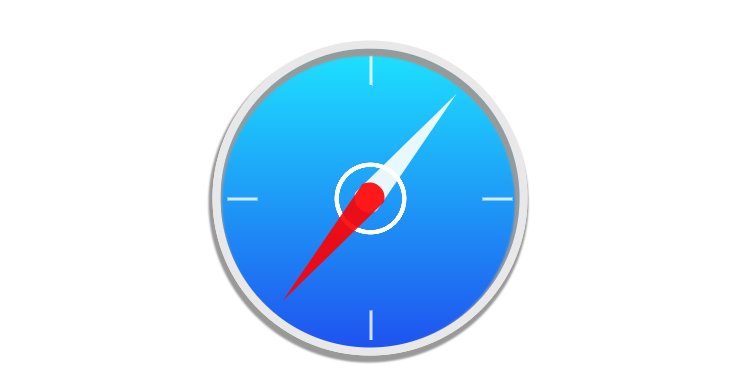
<div class="css-live-wrap">
        <summary>safari(单标签实现)</summary>
        <summary>利用渐变、border、旋转实现</summary>
        <hgroup class="safari">
          <h1></h1>
        </hgroup>
      </div>
      <style>
        .safari{
          position: absolute;
          top: 50%;left: 50%;
          width:200px; height:200px;
          transform: translate(-50%, -50%);
          border-radius:50%;
          border:5px solid #E8E8E8;
          box-shadow:
            -1px 3px 1px 2px #999,
            -1px 3px 1px 2px #999 inset;
          background-image:
            radial-gradient(transparent 30%,#fff 30%,#fff 34%, transparent 34%),
            linear-gradient(rgba(255,255,255,.8) 100%, transparent 100%),
            linear-gradient(rgba(255,255,255,.8) 100%, transparent 100%),
            linear-gradient(rgba(255,255,255,.8) 100%, transparent 100%),
            linear-gradient(rgba(255,255,255,.8) 100%, transparent 100%),
            linear-gradient(#1DE3FF 0%, #1F52EF 100%);
          background-size: 50% 50%,20px 2px,20px 2px,2px 20px,2px 20px,100%,100%;
          background-repeat:no-repeat;
          background-position:center center, 175px center,5px center,center 175px,center 5px,0 0;

        }
        .safari::before{
          content:"";
          position: absolute;
          top: 10px;left: 50%;
          border-radius:10px;
          /* width:20px; height:80px; */
          border-bottom:100px solid rgba(255,255,255,.9);
          border-left:10px solid transparent;
          border-right:10px solid transparent;
          transform-origin:center 90px;
          z-index:-1;
          transform:translate(-50%, 0%) rotate(40deg);
        }
        .safari::after{
          content:"";
          position: absolute;
          top: 10px;left: 50%;
          border-radius:10px;
          /* width:20px; height:80px; */
          border-bottom:100px solid rgba(255,0,0,.9);
          border-left:10px solid transparent;
          border-right:10px solid transparent;
          transform-origin:center 90px;
          transform:translate(-50%, 0%) rotate(220deg);
        }
        .safari:hover::before{
            transition:transform 1s;
            transform:translate(-50%, 0%) rotate(70deg);
        }
        .safari:hover::after{
            transition:transform 1s;
            transform:translate(-50%, 0%) rotate(250deg);
        }
      </style>
 随时随地看视频