
别问我为什么上汤不热(猥琐脸),友尽!
正经事
Tumblr 分享成功会有这么个动画,觉得挺有意思,就扒出来看了看……
第一感觉以为是 canvas 绘制的,后来发现居然是原生DOM操作,嘿嘿,我就喜欢这种!
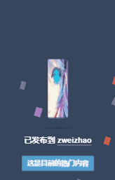
首先自然是去找 DOM 结构,Chrome 调试出来结果如下:
<div class="avatar-wrapper">
    <div class="avatar" style="background-image:url(https://78.media.tumblr.com/avatar_6fb5ef4a2436_64.pnj)"></div>
</div>
就是普通的 DOM,然后这里有个图片格式吓我一跳,pnj,第一次见,Google 查了下,就这么一段,我也不是很清楚这个格式:
PNJ檔案是主要與 Binary Data 相關的 Uncommon Files。其他類型的檔案也可能使用PNJ檔案副檔名。
使用的动画就两个,具体动画我们下面代码,其实很简单。
HTML
<div class="box">
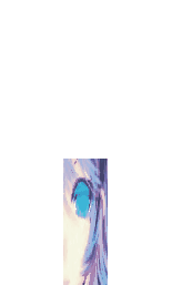
<img src="https://img.mukewang.com/5b8558e40001a7e600640064.jpg" alt="" class="rotate">
</div>
两层,外面负责跳动,里面图片负责旋转。
方便理解跟演示,已经替换成国内可访问的图片源以及 img 标签。
CSS
@keyframes jump {
  0% {
    transform: translateY(-180px) scaleY(1);
    animation-timing-function: cubic-bezier(.895,.03,.685,.22);
  }
  80% {
    transform: scaleY(2) scaleX(.6);
  }
  90% {
    transform: scaleY(.4) scaleX(1);
  }
  100% {
    transform: scaleY(.25) scaleX(2);
  }
}

.box {
  position: absolute;
  top: 200px;
  left: 50px;
  animation: jump .5s linear infinite alternate;
}

@keyframes dance {
  0% {
    transform: rotate(0deg);
  }
  21% {
    transform: rotate(0deg);
    animation-timing-function: cubic-bezier(.215,.61,.355,1);
  }
  28% {
    transform: rotate(-1turn);
  }
  71% {
    transform: rotate(-1turn);
    animation-timing-function: cubic-bezier(.215,.61,.355,1);
  }
  78% {
    transform: rotate(1turn);
  }
  100% {
    transform: rotate(1turn);
  }
}

.rotate {
  animation: dance 10s cubic-bezier(.645,.045,.355,1) .5s infinite
}
上面的源码进行了精简,汤不热应该是用了类继承导致一些这里用不到的代码。
其中涉及几个问题:
-
animation-timing-function
-
cubic-bezier
-
rotate 延时 0.5s 的作用
animation-timing-function
这个是对动画运行时间(或效果)的定制,一般我们都会写到 animation 里面,比如:linear、ease 等,对,没错,就这个东西。
我所知道的就是跟 cubic-bezier 一起用……搁下面一起说。
cubic-bezier
贝塞尔曲线,这个往深了说,我自己都蒙,玩 PS 的高手应该很熟悉这个东西,就是一个拉两边会让直线变曲线的东西,貌似钢笔工具有用到这个。
回到上面那个 linear,其实就是:animation-timing-function: cubic-bezier(0, 0, 1, 1) / cubic-bezier(1, 1, 0, 0);,而 ease 就是:animation-timing-function: cubic-bezier(.25, .1, .25, 1);。其他不再举例,有兴趣的可以查查,这样就可以理解那个移动轨迹的来历了。
所以 box 的动画就是上下跳动,在到达底部的时候 X 轴撑开,效果就这样,好理解的多。
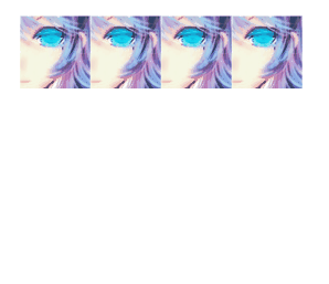
而里面图片的滚动,讲真,一开始我也看了好久才明白什么鬼,上面截图没有展示出来,下面的链接可以看看,它的转动两个方向是不一样的,很有意思。
其实看懂就很清楚了,这个转动动画一共花了 10s,前 28% 的时间进行了一次逆时针单圈,中间休息老久,然后后面 71% 开始到 78% 很短的时间进行了顺时针的两圈,看起来特别好玩,也很好看。
逆时针单圈

顺时针两圈
具体效果:点我看效果
rotate 延时 0.5s 的作用
为了让动画更自然,没有这个延时或者延时不对会出现跳动不自然,请自行源码尝试……
代码:
<!DOCTYPE html>
<html lang="en">
<head>
  <meta charset="UTF-8">
  <meta name="viewport" content="width=device-width, initial-scale=1.0">
  <meta http-equiv="X-UA-Compatible" content="ie=edge">
  <title>Jump Tumblr</title>
  <style>
    html, body {
      height: 100%;
    }
    body {
      display: flex;
      justify-content: center;
      align-items: center;
    }
    @keyframes jump {
      0% {
        transform: translateY(-180px) scaleY(1);
        animation-timing-function: cubic-bezier(.895,.03,.685,.22);
      }
      80% {
        transform: scaleY(2) scaleX(.6);
      }
      90% {
        transform: scaleY(.4) scaleX(1);
      }
      100% {
        transform: scaleY(.25) scaleX(2);
      }
    }

    .box {
      animation: jump .5s linear infinite alternate;
    }

    @keyframes dance {
      0% {
        transform: rotate(0deg);
      }
      21% {
        transform: rotate(0deg);
        animation-timing-function: cubic-bezier(.215,.61,.355,1);
      }
      28% {
        transform: rotate(-1turn);
      }
      71% {
        transform: rotate(-1turn);
        animation-timing-function: cubic-bezier(.215,.61,.355,1);
      }
      78% {
        transform: rotate(1turn);
      }
      100% {
        transform: rotate(1turn);
      }
    }

    .rotate {
      animation: dance 10s cubic-bezier(.645,.045,.355,1) .5s infinite
    }
  </style>
</head>
<body>
  <div class="box">
    <img src="https://img.mukewang.com/5b8558e40001a7e600640064.jpg" alt="" class="rotate">
  </div>
</body>
</html>
好了,这里基本说完了……
但是,像我这种神经病会这样简单的结束吗?
哼哼哼……
脑残版
终极版
代码:
<!DOCTYPE html>
<html lang="en">

<head>
  <meta charset="UTF-8">
  <meta name="viewport" content="width=device-width, initial-scale=1.0">
  <meta http-equiv="X-UA-Compatible" content="ie=edge">
  <title>Jump Tumblr</title>
  <style>
    html, body {
      height: 100%;
      overflow: hidden;
    }
    @keyframes jump {
      0% {
        transform: translateY(-140px) scaleY(1);
        animation-timing-function: cubic-bezier(.895, .03, .685, .22);
      }
      80% {
        transform: scaleY(2) scaleX(.6);
      }
      90% {
        transform: scaleY(.4) scaleX(1);
      }
      100% {
        transform: scaleY(.25) scaleX(2);
      }
    }

    .box {
      animation: jump .5s linear infinite alternate;
    }

    @keyframes dance {
      0% {
        transform: rotate(0deg);
      }
      21% {
        transform: rotate(0deg);
        animation-timing-function: cubic-bezier(.215, .61, .355, 1);
      }
      28% {
        transform: rotate(-1turn);
      }
      71% {
        transform: rotate(-1turn);
        animation-timing-function: cubic-bezier(.215, .61, .355, 1);
      }
      78% {
        transform: rotate(1turn);
      }
      100% {
        transform: rotate(1turn);
      }
    }

    .rotate {
      animation: dance 10s cubic-bezier(.645, .045, .355, 1) .5s infinite
    }

    .container {
      position: absolute;
      left: 0;
      top: 0;
      display: flex;
      justify-content: center;
      align-items: center;
      width: 100%;
      height: 100%;
    }

    .container:nth-child(2) {
      transform: rotateZ(45deg);
    }
    .container:nth-child(3) {
      transform: rotateZ(90deg);
    }
    .container:nth-child(4) {
      transform: rotateZ(135deg);
    }
    .container:nth-child(5) {
      transform: rotateZ(180deg);
    }
    .container:nth-child(6) {
      transform: rotateZ(225deg);
    }
    .container:nth-child(7) {
      transform: rotateZ(270deg);
    }
    .container:nth-child(8) {
      transform: rotateZ(315deg);
    }
  </style>
</head>

<body>
  <div class="container">
    <div class="box">
      <img src="https://img.mukewang.com/5b8558e40001a7e600640064.jpg" alt="" class="rotate">
    </div>
  </div>

  <div class="container">
    <div class="box">
      <img src="https://img.mukewang.com/5b8558e40001a7e600640064.jpg" alt="" class="rotate">
    </div>
  </div>

  <div class="container">
    <div class="box">
      <img src="https://img.mukewang.com/5b8558e40001a7e600640064.jpg" alt="" class="rotate">
    </div>
  </div>

  <div class="container">
    <div class="box">
      <img src="https://img.mukewang.com/5b8558e40001a7e600640064.jpg" alt="" class="rotate">
    </div>
  </div>

  <div class="container">
      <div class="box">
        <img src="https://img.mukewang.com/5b8558e40001a7e600640064.jpg" alt="" class="rotate">
      </div>
    </div>

    <div class="container">
      <div class="box">
        <img src="https://img.mukewang.com/5b8558e40001a7e600640064.jpg" alt="" class="rotate">
      </div>
    </div>

    <div class="container">
      <div class="box">
        <img src="https://img.mukewang.com/5b8558e40001a7e600640064.jpg" alt="" class="rotate">
      </div>
    </div>

    <div class="container">
      <div class="box">
        <img src="https://img.mukewang.com/5b8558e40001a7e600640064.jpg" alt="" class="rotate">
      </div>
    </div>

</body>

</html>
具体效果:点我看效果
告诫广大前端小伙伴,这个东西不要自己盲目创作,你懂的。如有必要,请甩锅给设计大大,实在不行,找对应的动画生成器去……
恩,目测汤不热的是动画生成器生成的没跑了。
对了,别问我后面的撒花效果,那是canvas,自己找库去,大把大把的有。DOM 动画才是真爱。
喜欢请点个 star,谢谢。
欢迎关注,如有需要 Web,App,小程序,请留言联系。


 随时随地看视频


热门评论
-

哪里飞的刘贝贝2018-09-12 0
查看全部评论炫酷