如何使我的 html 文本容器响应更快?
我的网站如下所示:
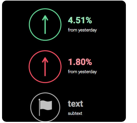
桌面:
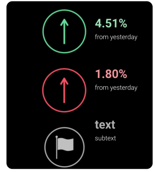
移动的:
我的HTML:
<div class="col-lg-3>
<div class="container--wrap">
<div class="inward-text">
<br>
<img src="green-up.png" class="center" style="vertical-align: middle;">
<br>
<span style="color: #9BDDB4; font-family: robotobold; font-size: 30px; vertical-align: middle;" "="">4.51%</span>
<br>
<span style="color: #ffffff; font-family: robotolight; font-weight: lighter; font-size: 15px">from yesterday</span>
<img src="red-up.png" class="center" style="padding-top: 30px; vertical-align: middle;">
<br>
<br>
<br>
<br>
<div id="txtdown">
<span style="color: #EE939C; font-family: robotobold; font-size: 30px; vertical-align: middle;">1.80%</span>
<br>
<span style="color: #ffffff; font-family: robotolight; font-weight: lighter; font-size: 15px">from yesterday</span>
</div>
<img src="flag-ic.png" class="center" style="padding-top: 30px; vertical-align: middle;">
<br>
<br>
<br>
<div id="txtdown">
<span style="color: #AEAEAE; font-family: robotobold; font-size: 30px; vertical-align: middle;">text</span>
<br>
<span style="color: #ffffff; font-family: robotolight; font-weight: lighter; font-size: 15px">subtext</span>
</div>
</div>
</div>
</div>
相关CSS:
.container--wrap {
background-color: #000000;
border-radius: 15px;
margin: 5px;
overflow: hidden;
}
.col-lg-3 {
flex: 0 0 25%;
max-width: 25%;
}
.col {
flex-basis: 0;
flex-grow: 1;
max-width: 100%;
}
.center {
display: block;
margin-left: auto;
margin-right: auto;
width: 135px;
}
.inward-text span{
display: inline;
margin-left: 10px;
}
.inward-text img{
margin-left: 80px;
float: left;
}
#txtdown{
margin-top: 10px;
}
我该如何做我想做的事?
 狐的传说
狐的传说3回答
-

慕村225694
br 标签这不是最好的方法,我尝试简化您的解决方案,用您的图像和文本块应该如下所示:<div class="items"> <div class="item red"> <img/> <div class="item__text"> <span class="percent"></span> <span class="description"></span> </div> </div> <div class="item green"> <img/> <div class="item__text"> <span class="percent"></span> <span class="description"></span> </div> </div> <div class="item grey"> <img/> <div class="item__text"> <span class="percent"></span> <span class="description"></span> </div> </div></div>CSS.items { display: flex; flex-direction: column;}.item { display: flex; align-items: center;}.item__text { display: flex; flex-direction: column;}并且不要使用be,使用margin或padding,这是一种更灵活可靠的做法。 -

慕哥6287543
网页:<div class="container--wrap"> <div class="inward-text"> <div class="flex"> <img src="green-up.png" class="center" style="vertical-align: middle;"> <div id="txtdown"> <span style="color: #9BDDB4; font-size: 30px; vertical-align: middle;">4.51%</span> <span style="color: #ffffff; font-weight: lighter; font-size: 15px">from yesterday</span> </div> </div> <div class="flex"> <img src="green-up.png" class="center" style="padding-top: 30px; vertical-align: middle;"> <div id="txtdown"> <span style="color: #EE939C; font-size: 30px; vertical-align: middle;">1.80%</span> <span style="color: #ffffff; font-weight: lighter; font-size: 15px">from yesterday</span> </div> </div> <div class="flex"> <img src="green-up.png" class="center" style="padding-top: 30px; vertical-align: middle;"> <div id="txtdown"> <span style="color: #AEAEAE; font-size: 30px; vertical-align: middle;">text</span> <span style="color: #ffffff; font-weight: lighter; font-size: 15px">subtext</span> </div> </div> </div> </div>CSS:.container--wrap { background-color: #000000; border-radius: 15px; margin: 5px; overflow: hidden;}.flex { display: flex;}.col-lg-3 { flex: 0 0 25%; max-width: 25%;}.col { flex-basis: 0; flex-grow: 1; max-width: 100%;}.inward-text span { display: inline; margin-left: 10px;}#txtdown { margin-top: 10px; display: flex; align-items: center; flex-direction: column; justify-content: center;} -

Helenr
步骤1从每个元素中删除所有内联样式,并将它们作为类放置在 CSS 中,如下所示:.percent { color: #EE939C; font-family: robotobold; font-size: 30px; vertical-align: middle;}.detail { color: #ffffff; font-family: robotolight; font-weight: lighter; font-size: 15px;}第2步删除所有<br/>s步骤3将每个项目包装为以下标记<div class="fancy-item"> <!-- your group --> <img ...> <div> <!-- flexbox sub-group --> <span class="percent">1.80%</span> <span class="detail">from yesterday</span> </div></div>添加其余的 CSS:.fancy-item { display: flex; align-items: center;}步骤4如果您想将它们稍微分开,请添加一些底部边距.percent或顶部边距。.detail你完成了!注意:您不必使用我的类名称,可以使用在您的上下文中有意义的任何名称。另请注意:步骤 1-3 是最重要的。如果您不喜欢某个特定细节,它们允许您立即更改所有项目,而无需仔细检查每个项目并进行修改。DRY是编程中最重要的原则之一。


 随时随地看视频慕课网APP
相关分类
 Html5
Html5