Safari 嵌套 Flex 问题
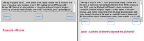
具有同级的嵌套弹性框为flex-grow : 1和Overflow-y : auto在 Safari 中无法按预期工作[我的版本 13.1 (14609.1.20.111.8)]。这在 Chrome 中再次表现出色。附上这两项的屏幕截图以及最小的可重现代码块。
如果我们给第二个子元素 flex-basis : [n]px 一个固定的大小..它工作得很好。但我们不能总是期望给出这一点,因为第二个项目中的内容是动态的。在下面的代码块中,它显示了最小的可重现用例。
.parent {
flex-direction: column;
display: flex;
background-color: #CCC;
padding: 8px;
height: 150px;
font-size: 16px;
}
.fixedChild {
display: flex;
padding: 10px;
justify-content: space-between;
flex-basis: auto;
}
.growingChild {
overflow-y: auto;
flex-grow: 1;
}
/*! CSS Used from: Embedded */
.fancyButton {
background-color: transparent;
border: 1px solid transparent;
border-color: #0076D1;
border-radius: 15px;
color: #0076D1;
height: 50px;
justify-content: center;
outline: none;
padding: 0 8px;
}
<div class="parent">
<div class="growingChild">
Contrary to popular belief, Lorem Ipsum is not simply random text. It has roots in a piece of classical Latin literature from 45 BC, making it over 2000 years old. Richard McClintock, a Latin professor at Hampden-Sydney College in Virginia, looked up one of the more obscure Latin words, consectetur, from a Lorem Ipsum passage, and going through the cites of the word in classical literature, discovered the undoubtable source. Lorem Ipsum comes from sections 1.10.32 and 1.10.33 of "de Finibus Bonorum et Malorum" (The Extremes of Good and Evil) by Cicero, written in 45 BC. This book is a treatise on the theory of ethics, very popular during the Renaissance. The first line of Lorem Ipsum, "Lorem ipsum dolor sit amet..", comes from a line in section 1.10.32.
</div>
<div class="fixedChild">
<button class="fancyButton" type="button">button 1</button>
<button class="fancyButton" type="button">button 1</button>
<button class="fancyButton" type="button">button 1</button>
</div>
</div>
 拉风的咖菲猫
1回答
-

胡子哥哥
这并没有解决潜在的不一致问题,而是将最后一个子项(弹性项目)设置为:flex-shrink: 0;似乎使 Safari 和 Chrome 的行为相同,其中 Flex 容器占按钮的高度以及不断增长的 Flex 项目同级。不确定谁对谁错,但我觉得也许是 Safari 🤔?

 随时随地看视频慕课网APP
相关分类
 Html5
Html5