Masonry Layout:防止div破裂或被切割
我的反应代码如下:
<div className="gridlist">
<div className="card">
{shops.map((shop) => (
<MediaCard
card={shop}
bname={shop.bname}
description={shop.description}
/>
))}
</div>
</div>
{shops.map((shop) => ( 部分只是从我制作的数据库中获取信息,我想以 CSS 砖石格式显示该信息。 MediaCard组件只是我做的一个组件,保存了一些信息,比如标题、描述、图片等。
我的CSS代码:
/* The Masonry Container */
.gridlist {
margin: 1.5em auto;
max-width: 768px;
column-gap: 1.5em;
row-gap: 1.5em;
}
/* The Masonry Brick */
.card {
padding: 1em;
margin: 0 0 1.5em;
}
/* Masonry on large screens */
@media only screen and (min-width: 1024px) {
.gridlist {
column-count: 2;
}
}
/* Masonry on medium-sized screens */
@media only screen and (max-width: 1023px) and (min-width: 768px) {
.gridlist {
column-count: 2;
}
}
/* Masonry on small screens */
@media only screen and (max-width: 767px) and (min-width: 540px) {
.gridlist {
column-count: 1;
}
}
问题是这样的:
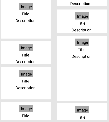
正如你所看到的,一个盒子被切断了。那么我该如何解决这个问题呢?
 慕后森
慕后森1回答
-

largeQ
过了一段时间我终于找到了解决方案。我将 .gridlist className 样式更改为:.gridlist { width: 1500px; margin: 20px auto; columns: 4; column-gap: 40px;}我还将 .card className 样式更改为:.card { width: 100%; margin: 0 0 20px; padding: 10px; overflow: hidden; margin-bottom: 30px;}对于我的 MediaCard 组件,我添加了一个 className .MediaCard。然后我将其添加到我的 CSS 中:.MediaCard { max-width: 100%; margin-bottom: 30px; -webkit-column-break-inside: avoid; page-break-inside: avoid; break-inside: avoid;}最后,我添加了一些响应式样式:@media (max-width: 1650px) { .gridlist { columns: 3; width: calc(100% - 40px); box-sizing: border-box; padding: 20px 20px 20px 0; }}@media (max-width: 768px) { .gridlist { columns: 2; }}@media (max-width: 480px) { .gridlist { columns: 1; }}但是,我仍然不知道我以前的代码有什么问题。如果有人能告诉我,谢谢!

 随时随地看视频慕课网APP
相关分类
 Html5
Html5