使 div 比其父级更宽,没有水平滚动条且没有溢出:隐藏?
是否有可能在不进行水平滚动的情况下让子元素超过父元素的宽度达到浏览器的整个范围?
我已经尝试过这里发布的解决方案有没有办法使用 CSS 使子 DIV 的宽度比父 DIV 更宽?
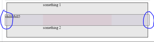
但是对于这个特定的 HTML(见下文),只有一个可以工作并创建水平滚动条(代码片段和下面的图像中看到的额外宽度导致滚动条出现)
*我总是可以添加一个overflow-x: hidden;,<body>但我不想这样做
编辑:有一些 css 属性,即使在示例中没有意义,它们也应该保留在解决方案中(如果有)
<div class="main">
<div class="container">
<div class="fit">
something 1
</div>
<div class="parent">
<header class="full full5">
child full5
</header>
</div>
<div class="fit">
something 2
</div>
</div>
</div>
body: {
margin: 0px;
}
.main {
display: flex;
flex-direction: column;
align-items: center;
background: #e8e8e8;
border: 1px solid #000;
margin: 0px;
box-sizing: border-box;
}
.container {
display: flex;
flex-direction: column;
max-width: 300px;
width: 100%;
}
.parent {
display: flex;
/* flex-direction: column; */
width: 100%;
background-color: #e9cccc;
box-sizing: border-box;
position: sticky;
top: 0;
}
.fit {
height: 50px;
}
.full {
background-color: #d1ccd8a6;
border: 1px solid #666;
border-radius: 3px;
height: 50px;
padding: 0px;
box-sizing: border-box;
}
.full5 {
width: 100vw;
position: relative;
left: 50%;
right: 50%;
margin-left: -50vw;
margin-right: -50vw;
}
如果<body>有margin:0发布的解决方案有效,除非有垂直滚动条(什么时候没有?)
 慕森卡
慕森卡3回答
-
慕码人2483693
在这里(全屏查看以进行可视化):body { margin: 0;}.main { display: flex; flex-direction: column; align-items: center; background: #e8e8e8; border: 1px solid #000; margin: 0px; box-sizing: border-box;}.container { display: flex; flex-direction: column; max-width: 300px; width: 100%;}.parent { display: flex; /* flex-direction: column; */ width: 100%; background-color: #e9cccc; box-sizing: border-box; position: sticky; top: 0;}.fit { height: 50px;}.full { background-color: #d1ccd8a6; border: 1px solid #666; border-radius: 3px; height: 50px; padding: 0px; box-sizing: border-box;}.full1 { position: absolute; width: 100%; left: 0px; top: 0px;}.full2 { width: 100vw; position: relative; left: calc(-50vw + 50%);}.full3 { position: relative; width: 200%; left: -50%;}.full4 { margin-left: calc(-50vw + 50%); width: 100vw;}.full5 { width: 100vw; position: relative; left: 50%; right: 50%; margin-left: -50vw; margin-right: -50vw;}.full6 { margin-left: calc(-50vw + 50%); width: 100vw;}.hide { display: none;}<div class="main"> <div class="container"> <div class="fit"> something 1 </div> <div class="parent"> <header class="full full1 hide"> child full1 </header> <header class="full full2 hide "> child full2 </header> <header class="full full3 hide"> child full3 </header> <header class="full full4 hide"> child full4 </header> <header class="full full5"> child full5 </header> <header class="full full6 hide"> child full6 </header> </div> <div class="fit"> something 2 </div> </div></div> -

SMILET
这是你想要的吗?我刚刚更改了您的 CSS .main,.parent并且.full-5body: { margin: 0px;}.main { display: flex; flex-direction: column; align-items: center; background: #e8e8e8; border: 1px solid #000; margin: 0px; box-sizing: border-box; position: relative;}.container { display: flex; flex-direction: column; max-width: 300px; width: 100%;}.parent { display: flex; /* flex-direction: column; */ width: 100%; background-color: #e9cccc; box-sizing: border-box; top: 0; height: 50px;}.fit { height: 50px;}.full { background-color: #d1ccd8a6; border: 1px solid #666; border-radius: 3px; height: 50px; padding: 0px; box-sizing: border-box;}.full1 { position: absolute; width: 100%; left: 0px; top: 0px;}.full2 { width: 100vw; position: relative; left: calc(-50vw + 50%);}.full3 { position: relative; width: 200%; left: -50%;}.full4 { margin-left: calc(-50vw + 50%); width: 100vw;}.full5 { position: absolute; left: 0; right: 0;}.full6 { margin-left: calc(-50vw + 50%); width: 100vw;}.hide { display: none;}<div class="main"> <div class="container"> <div class="fit"> something 1 </div> <div class="parent"> <header class="full full1 hide"> child full1 </header> <header class="full full2 hide "> child full2 </header> <header class="full full3 hide"> child full3 </header> <header class="full full4 hide"> child full4 </header> <header class="full full5"> child full5 </header> <header class="full full6 hide"> child full6 </header> </div> <div class="fit"> something 2 </div> </div></div> -

拉风的咖菲猫
您可以在 css 代码中使用 z-index 来引入父级并填充颜色以推动背景


 随时随地看视频慕课网APP
相关分类
 Html5
Html5