将辅助独立轴添加到颜色条图中
我尝试将辅助 x 轴添加到图的顶部作为 nm 比例,可以使用相关函数(例如 nm = 495.04-x*0.059)从像素中获得该比例,是否有任何想法如何做到这一点,我尝试过多次但失败了...谢谢
代码:
import os
import numpy as np
import pandas as pd
import matplotlib.pyplot as plt
from matplotlib import cm
data = pd.read_csv('BS3053_BFI.dat', sep='.', delimiter='\t',engine = 'python', skiprows=0, header=None)
data = pd.DataFrame(data).transpose()
pixel_x = data.shape[1] # pixels in x direction
pixel_y = data.shape[0] # pixels in y direction
fig = plt.figure()
ax1 = fig.add_subplot(111)
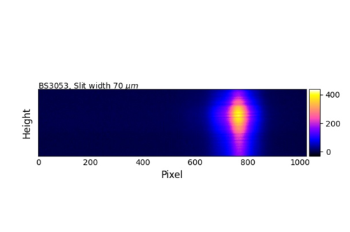
im = ax1.imshow(data, cmap=plt.cm.gnuplot2,extent=[0,1024,257,0],interpolation=None)# ,,
ax1.set_xlabel('Pixel', fontsize=12)[![enter image description here][1]][1]
ax1.set_ylabel('CCD height', fontsize=12)
ax1.set_ylim([0, 257])
ax1.set_yticklabels([])
ax1.tick_params(direction='in',axis='both', length=.1)
ax1.text(0,259, r'BS3053, Slit width 70 $\mu m$', fontsize=10)
# create an axes on the right side of ax. The width of cax will be 5%
# of ax and the padding between cax and ax will be fixed at 0.05 inch.
divider = make_axes_locatable(ax1)
cax = divider.append_axes("right", size="4%", pad=0.05)
plt.colorbar(im, cax=cax);
plt.show()
 跃然一笑
跃然一笑1回答
-

侃侃尔雅
有时候,一种简单的思维方式可以让你的生活变得轻松……它已经解决了。'''import osimport numpy as npimport pandas as pdimport matplotlib.pyplot as pltfrom matplotlib import cmfrom mpl_toolkits.axes_grid1 import make_axes_locatable from matplotlib.ticker import AutoLocatordata = pd.read_csv('BS2350_slit_60um.dat', sep='.', delimiter='\t',engine = 'python', skiprows=0, header=None) data = pd.DataFrame(data).transpose()pixel_x = data.shape[1] # pixels in x directionpixel_y = data.shape[0] # pixels in y directionfig = plt.figure(figsize=(6.4, 6.4))ax = fig.add_subplot(111)ax.set_aspect('auto')im = ax.imshow(data, cmap=plt.cm.gnuplot2,aspect='equal',extent=[0,1024,257,0],interpolation=None)# ,,ax.set_xlabel('Pixel', fontsize=12)ax.set_ylabel('CCD height', fontsize=12)ax.set_ylim([0, 257])#ax.set_xticklabels([])ax.set_yticklabels([])ax.tick_params(direction='in',axis='both', length=.1)#ax.text(0,259, r'slit width, 40 $\mu m$, minimum slit height', fontsize=10)#print(data[1][:])pixel = np.linspace(0,1024)def pixelTonm(pixel): nm = 495.04-pixel*0.059 return nm def nmTopixel(nm): pixel = (495.04-nm) / 0.059 return pixel ax2 = ax.secondary_xaxis('top', functions=(pixelTonm,nmTopixel)) ax2.set_xlabel('Wavelength / nm', fontsize=12)ax2.tick_params(direction='out',axis='x', length=2)# create an axes on the right side of ax. The width of cax will be 5%# of ax and the padding between cax and ax will be fixed at 0.05 inch.divider = make_axes_locatable(ax)cax = divider.append_axes("right", size="2.5%", pad=0.05)plt.colorbar(im, cax=cax);plt.savefig('slit_40um_rf_.jpg') [![Afert adding the second axis on the top, and how it looks like][1]][1]plt.show()'''

相关分类
 Python