如何使用 gridspec 指定子图布局
我正在尝试plt.GridSpec()设置两个子图,使左边的子图占据大约 67% 的空间,右边的子图占据 33% 的空间。
我查看了文档,但我似乎无法弄清楚如何设置索引——可能是由于缺乏 numpy 切片的经验。
可重复的例子
%matplotlib inline
import matplotlib.pyplot as plt
import pandas as pd
## Dummy Data
x = [0, 0.03, 0.075, 0.108, 0.16, 0.26, 0.37, 0.49, 0.76, 1.05, 1.64,
0.015, 0.04, 0.085, 0.11, 0.165, 0.29, 0.37, 0.6, 0.78, 1.1]
y = [16.13, 0.62, 2.15, 41.083, 59.97, 13.30, 7.36, 6.80, 4.97, 3.53, 11.77,
30.21, 64.47, 57.64, 56.83, 46.69, 4.22, 30.35, 35.12, 5.22, 25.32]
label = ['blue', 'blue', 'blue', 'blue', 'blue', 'blue', 'blue', 'blue', 'blue', 'blue', 'blue',
'red', 'red', 'red', 'red', 'red', 'red', 'red', 'red', 'red', 'red', 'red']
df = pd.DataFrame(
list(zip(x, y, label)),
columns =['x', 'y', 'label']
)
## Plotting
fig = plt.figure(figsize=([10,8]))
grid = plt.GridSpec(1, 3, wspace=0.4, hspace=0.3)
ax1 = plt.subplot(grid[0, :1])
ax2 = plt.subplot(grid[0, 2], sharey = ax1)
ax1.scatter(x=df.y, y=df.x, color=df.label)
df_red = df[df['label'] == "red"]
df_blue = df[df['label'] == "blue"]
myhist = ax2.hist([df_blue.x, df_red.x],
density=False,
edgecolor='black',
color=['blue', 'red'],
cumulative=False,
bins='auto',
orientation='horizontal',
stacked=True,
label=['Blue', 'Red'])
ax1.set_xlabel('length')
ax1.set_ylabel('value')
ax2.set_xlabel('frequency')
ax2.set_ylabel('value')
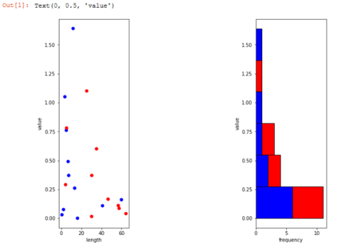
当前结果
所需结果
相同的图,只是左:右比例为 67% : 33%(因此左图比右图宽)。
 墨色风雨
墨色风雨1回答
-

POPMUISE
这是您需要进行的小修改:# one position less than 3rd column ax1 = plt.subplot(grid[0, :-1])

相关分类
 Python