为什么布局没有像图像中那样显示?
我想要有一个如图所示的布局结构,其中“标题”文本在中心对齐,链接在右侧对齐,在左列中我有一些文本,在每个文本下方,有一个在中心对齐的图像:
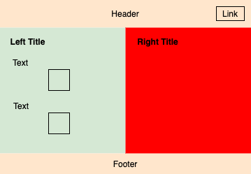
但它无法正常工作,我试图获得这样的布局“ https://jsfiddle.net/e2gvbjyq ”,但有 3 个问题:
链接“链接”未与“标题”文本正确垂直对齐,且未正确右对齐
左列中的图像没有像上图那样在中心对齐
右列中的对该
padding:1em列没有任何影响页脚不会像上图那样出现在底部
你知道为什么吗?我是初学者,所以我尝试使用 margin、float 等基础知识来实现这种布局。
超文本标记语言
<!DOCTYPE html>
<html>
<head>
<title>Title of the document</title>
<meta name="viewport" content="width=device-width">
<link rel="stylesheet" type="text/css" href="css/style.css">
</head>
<body>
<header>
<h1>Title</h1>
<a href="#">Link</a>
</header>
<section id="content-left">
<article>
<h2>Left Title</h2>
<p>Lorem ipsum dolor sit amet, consectetur adipisicing elit. Vitae officiis neque atque amet fugit, eveniet at maxime nesciunt. Sint repellat neque necessitatibus ea sequi tempora, dolor non, possimus magni odio</p>
<img src="http://via.placeholder.com/300">
<p>Lorem ipsum dolor sit amet, consectetur adipisicing elit. Vitae officiis neque atque amet fugit, eveniet at maxime nesciunt. Sint repellat neque necessitatibus ea sequi tempora, dolor non, possimus magni odio.</p>
<img src="http://via.placeholder.com/300">
<p class="issue"><b>(Issue: Images are not aligned at center)</b></p>
</article>
</section>
<section id="content-right">
<article>
<h2>Right Title</h2>
<p class="issue">(Issue: padding left is not working)</p>
</article>
</section>
<footer>
<h1>Footer</h1>
<p><b class="issue">(Issue: footer is not at bottom of the page)</b></p>
</footer>
</body>
</html>
 至尊宝的传说
1回答
-

潇潇雨雨
您可以添加额外的 div 并使其灵活。页眉宽度:100% 内容右:宽度:50% 内容左:宽度:50% 页脚宽度:100% <body><div class="conteiner"> <header> <section id="content-right"> <section id="content-left"> <footer> </div> </body></html>.conteiner{ display:flex; flex-wrap: wrap;}链接到您的代码: https://codepen.io/Vova_Champion_1/pen/JjdqbLr

 随时随地看视频慕课网APP
相关分类
 Html5
Html5