Python Matplotlib LEGEND 自定义
有没有办法将下方的两个指标移动到图例中红线下方的左侧?或者将图例中的红线移到 0.93 的右侧?如果失败了,有一种快速的方法可以将 R2 与 RMSE 和 MAE 分开,并且有两个互不干扰的图例 - 我的意思是我可以将一个堆叠在另一个之上并且它们具有不同的设置 - (我已经尝试过并且他们不这样做)
这是我的图例部分代码:
handles = [mpl_patches.Rectangle((0, 0), 1, 1, fc="white", ec="white",
lw=0, alpha=0)] * 4
lines = []
handles[0] = Line2D([0], [0], color='red',lw=3)
labels = []
labels.append("R² = {0:.2g}".format(Rsquared))
#labels.append("MSE = {0:.2g}".format(mse))
leg = ax.legend(handles, labels, loc='best', fontsize='x-large',
fancybox=True, framealpha=0.7)
labels.append("RMSE = {0:.2g}".format(rmse))
labels.append("MAE = {0:.2g}".format(mae))
如果甚至有一种方法可以在图表上标记红线本身,那也很好。这是图表本身的代码:
fig, ax = plt.subplots()
ax.scatter(y_test, y_predicted ,s=10,color='darkslateblue',linewidths=1)
ax.plot([y.min(), y.max()], [y.min(), y.max()], 'k-', lw=1.75)
ax.set_xlabel('Actual (%)',fontsize='large')
ax.set_ylabel('Predicted (%)',fontsize='large')
y_test, y_predicted = y_test.reshape(-1,1), y_predicted.reshape(-1,1)
ax.plot(y_test, LinearRegression().fit(y_test, y_predicted).predict(y_test), color="red", lw=1.75)
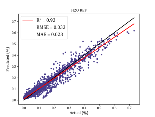
黑线是 y=x。
请帮忙!我已经在这几天了。这是一个很小的变化,但对我的报告至关重要。
 守候你守候我
1回答
-

慕丝7291255
虽然我不能完全理解您实际需要什么或如何绘制您的确切数据,但我认为您的意思是简单地分开您的传说?例如,使用您的代码,这是一个带有单独图例的虚拟图:plt.figure()handles = [ Line2D([0], [0], color='red',lw=3), Line2D([0], [0], color='white',lw=3), Line2D([0], [0], color='white',lw=3)] labels = []labels.append("R² = {0:.2g}".format(0.93))L1 = plt.legend(handles[:1], labels, loc='upper left', fontsize='x-large', fancybox=True, framealpha=0.7)ax = plt.gca().add_artist(L1)labels_ = []labels_.append("RMSE = {0:.2g}".format(0.033))labels_.append("MAE = {0:.2g}".format(0.023))plt.legend(handles[1:], labels_, loc='lower right', fontsize='x-large', fancybox=True, framealpha=0.7)plt.show()这会给出类似的东西:

相关分类
 Python