绘图,半极坐标图,将角轴设置为 -90° 到 90°
我正在尝试用 python 绘制一个极坐标图,并以 plotly 显示二维图像中纤维的方向(请参阅下面的代码)。如果您能向我展示如何更改角轴(当前范围从 0° 到 360°)以匹配我的数据范围从 -90° 到 90°,那就太好了。下面是半极坐标图的示例图像、我的数据格式和我的代码。
import plotly.graph_objs as go
from plotly import plotly
import plotly.offline as offline
import numpy as np
# data
x= np.genfromtxt(see data image)
y= np.genfromtxt(see data image)
trace = [
go.Scatterpolar(
r = [y], #radial coordinates
theta = [x], #angular coordinates
mode = 'markers',
marker = dict(
color = 'peru'
)
)
]
layout = go.Layout(
showlegend = True,
polar = dict(
domain = dict( # set chart size and position
x = [0, 0.8],
y = [0.3, 0.8]),
sector = [0, 180], # set chart shape (half or full)
angularaxis = dict(
thetaunit = "degrees",
dtick = 10),
radialaxis = dict(
range = [1, 8000])
))
fig = go.Figure(data=trace, layout=layout)
offline.plot(fig)
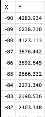
xy数据
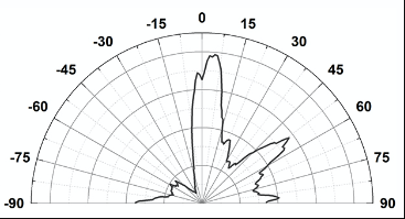
纤维取向的半极坐标图
 海绵宝宝撒
海绵宝宝撒2回答
-

MMMHUHU
如果有人知道如何旋转它(逆时针旋转 90°)并镜像它(-90 左,0 上,90 右),请告诉我。我试图rotation=和direction=命令,但与它们没有工作,碰撞sector=命令为角轴设置范围从-90到90。干杯,罗恩import plotly.graph_objs as gofrom plotly import plotlyimport plotly.offline as offlineimport numpy as npimport plotly# datax= np.genfromtxt("data.csv", delimiter=",", usecols=(0), skip_header=1, encoding = 'unicode_escape')y= np.genfromtxt("data.csv", delimiter=",", usecols=(1), skip_header=1, encoding = 'unicode_escape')trace = [ go.Scatterpolar( r = [float(a) for a in y], #radial coordinates theta = [float(b) for b in x], #angular coordinates mode = 'lines', marker = dict( color = 'peru' ) )]layout = go.Layout( showlegend = True, legend=dict( x=1), polar = dict( domain = dict( # set chart size and position x = [0, 1], y = [0, 1]), sector = [-90,90], # set chart shape (half or full) angularaxis = dict( thetaunit = "degrees", dtick = 10, #rotation = -90, #does not work #direction = "clockwise" # does not work ), radialaxis = dict( range = [1, 6500])))fig = go.Figure(data=trace, layout=layout)offline.plot(fig) -

桃花长相依
好的,所以我只通过进行以下更改来获得输出:更改go.Layout sector=[0, 180]为sector=[-90, 90]更改go.Scatterplot r=[y]为r=[float(a) for a in y]更改go.Scatterplot theta=[x]为theta=[float(b) for b in x]第一个更改创建了您需要的范围(-90 到 90)第二次和第三次更改将结果从np.genfromtext()字符串转换为数字(尽管如果您的数据在x和 中已经是数字,则可能不需要这些更改y)。我的代码现在看起来像这样:import plotly.graph_objs as goimport plotly.offline as offlineimport numpy as np# datax = np.genfromtxt([str(i) for i in range(-90, 91)])y = np.genfromtxt([str(i * 25 + np.random.randint(1000, 2500)) for i in range(0, 181)])trace = [ go.Scatterpolar( r=[float(a) for a in y], # radial coordinates theta=[float(b) for b in x], # angular coordinates thetaunit="degrees", mode='markers', marker=dict( color='peru' ) )]layout = go.Layout( showlegend=True, polar=dict( domain=dict( # set chart size and position x=[0, 0.8], y=[0.3, 0.8]), sector=[0, 1800], # set chart shape (half or full) angularaxis=dict( thetaunit="degrees", dtick=10, rotation=90, direction='clockwise'), radialaxis=dict( range=[1, 8000]) ))fig = go.Figure(data=trace, layout=layout)offline.plot(fig)这些变化足以产生以下结果:


相关分类
 Python