在表单元素中,单选按钮和复选按钮都具有选中和未选中状态。(大家都知道,要覆写这两个按钮默认样式比较困难)。在CSS3中,我们可以通过状态选择器“:checked”配合其他标签实现自定义样式。而“:checked”表示的是选中状态。
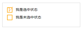
示例演示:
通过“:checked”状态来自定义复选框效果。
HTML代码
<form action="#"> <div class="wrapper"> <div class="box"> <input type="checkbox" checked="checked" id="usename" /><span>√</span> </div> <lable for="usename">我是选中状态</lable> </div> <div class="wrapper"> <div class="box"> <input type="checkbox" id="usepwd" /><span>√</span> </div> <label for="usepwd">我是未选中状态</label> </div> </form>
CSS代码:
form {
border: 1px solid #ccc;
padding: 20px;
width: 300px;
margin: 30px auto;
}
.wrapper {
margin-bottom: 10px;
}
.box {
display: inline-block;
width: 20px;
height: 20px;
margin-right: 10px;
position: relative;
border: 2px solid orange;
vertical-align: middle;
}
.box input {
opacity: 0;
position: absolute;
top:0;
left:0;
}
.box span {
position: absolute;
top: -10px;
right: 3px;
font-size: 30px;
font-weight: bold;
font-family: Arial;
-webkit-transform: rotate(30deg);
transform: rotate(30deg);
color: orange;
}
input[type="checkbox"] + span {
opacity: 0;
}
input[type="checkbox"]:checked + span {
opacity: 1;
}
结果演示
在CSS编辑器的第47行输入正确的代码,实现自定义单选按钮的效果。
<!DOCTYPE html> <html> <head> <meta charset="utf-8"> <title>属性选择器</title> <link href="style.css" rel="stylesheet" type="text/css"> </head> <body> <form action="#"> <div class="wrapper"> <div class="box"> <input type="radio" checked="checked" id="boy" name="1" /><span></span> </div> <label for="boy">男</label> </div> <div class="wrapper"> <div class="box"> <input type="radio" id="girl" name="1" /><span></span> </div> <label for="girl">女</label> </div> </form> </body> </html>
form { border: 1px solid #ccc; padding: 20px; width: 300px; margin: 30px auto; } .wrapper { margin-bottom: 10px; } .box { display: inline-block; width: 30px; height: 30px; margin-right: 10px; position: relative; background: orange; vertical-align: middle; border-radius: 100%; } .box input { opacity: 0; position: absolute; top:0; left:0; width: 100%; height:100%; z-index:100;/*使input按钮在span的上一层,不加点击区域会出现不灵敏*/ } .box span { display: block; width: 10px; height: 10px; border-radius: 100%; position: absolute; background: #fff; top: 50%; left:50%; margin: -5px 0 0 -5px; z-index:1; } input[type="radio"] + span { opacity: 0; } input[type="radio"]? + span { opacity: 1; }