将子div高度限制为父容器高度
我希望图表div 的高度能够一直延伸到其父(graph-container)容器的末尾,但不会延伸超过它。我尝试将图形的高度设置为 100% 并继承,但这两种方法都会导致它超出其父容器的底部边缘(我不想使用溢出:隐藏)。有没有办法在图形上设置高度属性,以便它自动将其高度设置为正确的值?
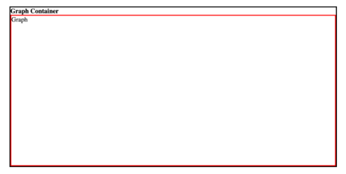
电流输出:
我想要的是:
当前代码:
* {
margin: 0;
padding: 0;
box-sizing: border-box;
font-size: 20px;
}
.wrapper {
height: 100vh;
width: 100vw;
display: flex;
justify-content: center;
}
.graph-container {
border: 3px solid black;
height: 60vh;
width: 70vw;
margin-top: 10vh;
}
.graph {
height: 100%;
width: 100%;
border: 3px solid red;
}
<!DOCTYPE html>
<html>
<head>
<meta charset="UTF-8" />
<meta name="viewport" content="width=device-width, initial-scale=1.0" />
<title>Document</title>
<link rel="stylesheet" href="style.css" />
</head>
<body>
<div class="wrapper">
<div class="graph-container">
<h1>Graph Container</h1>
<div class="graph">Graph</div>
</div>
</div>
</body>
</html>
2回答
-
繁星淼淼
您看到的溢出发生是因为已经有一个元素占用了父元素的一些height: 100%空间,所以加上另一个元素的高度将明显超过父元素的高度。解决问题的方法有多种。我推荐以下两种方法之一:CSS 弹性盒CSS 网格但是,您也可以使用以下方法解决它们:CSScalc()JavaScriptCSS 弹性盒父级需要display: flex将flex-direction: column其子级排列在一列中。要长大的孩子需要占据剩余的空间flex-grow: 1。/* Ignore; only for displaying the example */* { margin: 0; font-size: 24px;}html, body { width: 100%; height: 100%; display: flex; justify-content: center; align-items: center;}.graph-container, .graph { border: 3px solid black; box-sizing: border-box;}/* The answer */.graph-container { height: 60vh; width: 70vw; display: flex; flex-flow: column; /* Shorthand for ('flex-direction' | 'flex-wrap') */}.graph { flex-grow: 1; border-color: red;}<div class="graph-container"> <h1>Graph Container</h1> <div class="graph">Graph</div></div>CSS 网格家长需要display: grid和grid-template-rows: auto 1fr。grid-template-rows: auto 1fr使第二个子项占用其他子项获得在没有 -unit 的情况下定义的各自空间后剩余的剩余空间fr。在这里,<h1>获取其所需的空间,并将所有剩余空间赋予.graph。/* Ignore; only for displaying the example */* { margin: 0; font-size: 24px;}html, body { width: 100%; height: 100%; display: flex; justify-content: center; align-items: center;}.graph-container, .graph { border: 3px solid black; box-sizing: border-box;}/* The answer */.graph-container { height: 60vh; width: 70vw; display: grid; grid-template-rows: auto 1fr;}.graph { border-color: red;}<div class="graph-container"> <h1>Graph Container</h1> <div class="graph">Graph</div></div>CSScalc()font-size与 的关系height这并不总是正确的,因为height实际上取决于line-height,这又取决于当前使用的字体。问题如图所示例如,这line-height大约比给定字体1.05高 - 倍。font-size由于浏览器无法显示小于px- 单位的内容,因此小数位会被有效地截断。这使得该方程仅适用于较小的 值font-size,如下面的示例所示。示例(toInt()截去小数位):toInt(20px of 'font-size' * 1.05) = 20px of 'height'toInt(60px of 'font-size' * 1.05) = 63px of 'height'这意味着,虽然这有效(对于小font-size值)calc(100% - 20px - 3px):(20px由于font-size,3px由于border-width)/* Ignore; only for displaying the example */* { margin: 0; font-size: 24px;}html, body { width: 100%; height: 100%; display: flex; justify-content: center; align-items: center;}.graph-container, .graph { border: 3px solid black; box-sizing: border-box;}/* The answer */.graph-container { height: 60vh; width: 70vw;}h1 { font-size: 20px;}.graph { height: calc(100% - 20px - 3px); display: block; border-color: red;}<div class="graph-container"> <h1>Title</h1> <div class="graph">Graph</div></div>...这不起作用(对于大font-size值)calc(100% - 60px - 3px):(60px由于font-size,3px由于border-width)/* Ignore; only for displaying the example */* { margin: 0; font-size: 24px;}html, body { width: 100%; height: 100%; display: flex; justify-content: center; align-items: center;}.graph-container, .graph { border: 3px solid black; box-sizing: border-box;}/* The answer */.graph-container { height: 60vh; width: 70vw;}h1 { font-size: 60px;}.graph { height: calc(100% - 60px - 3px); display: block; border-color: red;}<div class="graph-container"> <h1>Title</h1> <div class="graph">Graph</div></div>这就是为什么最好实际定义 -propertyheight本身,而不是依赖font-size或line-height与其相同height(显然并不总是如此)。这让我们...使用 CSS 自定义属性您将第二个子项的高度设置为剩余空间,其中calc(100% - TITLE_HEIGHT)是TITLE_HEIGHT另一个子项的高度,<h1>。我们可以使用CSS 自定义属性来设置高度以减少“幻数”的数量,这使得稍后重构代码变得更容易,并且可能已经更容易阅读。我用的--title-height是高度。自定义属性只能在元素本身及其子元素中访问,这意味着我们需要在其父元素中定义它.graph-container。现在我们可以通过如下方式--title-height解析它来使用的值:var()var(--title-height)...这不起作用(对于大font-size值)calc(100% - 60px - 3px):(60px由于font-size,3px由于border-width)/* Ignore; only for displaying the example */* { margin: 0; font-size: 24px;}html, body { width: 100%; height: 100%; display: flex; justify-content: center; align-items: center;}.graph-container, .graph { border: 3px solid black; box-sizing: border-box;}/* The answer */.graph-container { height: 60vh; width: 70vw;}h1 { font-size: 60px;}.graph { height: calc(100% - 60px - 3px); display: block; border-color: red;}<div class="graph-container"> <h1>Title</h1> <div class="graph">Graph</div></div>这种方法的问题是,一旦找到高度就会被固定。这将导致.graph不响应。为了实现.graph响应式,我们需要观察父级是否使用ResizeObserver.每次父级调整大小时,都会重新计算 的大小.graph。/* The answer */var container = document.querySelector('.graph-container');var title = document.querySelector('h1');var graph = document.querySelector('.graph');new ResizeObserver(() => { graph.style.height = container.clientHeight - title.clientHeight + "px";}).observe(container);/* Ignore; only for displaying the example */* { margin: 0; font-size: 24px;}html, body { width: 100%; height: 100%; display: flex; justify-content: center; align-items: center;}.graph-container, .graph { border: 3px solid black; box-sizing: border-box;}.graph-container { height: 60vh; width: 70vw;}.graph { border-color: red; display: block;}<div class="graph-container"> <h1>Graph Container</h1> <div class="graph">Graph</div></div>00 -
临摹微笑
我还想建议一个使用的解决方案calc()。即:height: calc(100% - 23px);其中 23px 是h1标签 ( font-size: 20px),边框graph类是 3 像素 ( border: 3px solid red)。在此示例中,子 div 的高度将完全适合父 div 内。* { margin: 0; padding: 0; box-sizing: border-box; font-size: 20px;}.wrapper { height: 100vh; width: 100vw; display: flex; justify-content: center;}.graph-container { border: 3px solid black; height: 60vh; width: 70vw; margin-top: 10vh;}.graph { height: calc(100% - 23px); width: 100%; border: 3px solid red;}<!DOCTYPE html><html> <head> <meta charset="UTF-8" /> <meta name="viewport" content="width=device-width, initial-scale=1.0" /> <title>Document</title> <link rel="stylesheet" href="style.css" /> </head> <body> <div class="wrapper"> <div class="graph-container"> <h1>Graph Container</h1> <div class="graph">Graph</div> </div> </div> </body></html>00
相关分类