如何在图表上漂亮地打印标签
我有这个数据框:
{'date': {0: Timestamp('2019-10-31 00:00:00'),
1: Timestamp('2019-11-30 00:00:00'),
2: Timestamp('2019-12-31 00:00:00'),
3: Timestamp('2020-01-31 00:00:00'),
4: Timestamp('2020-02-29 00:00:00'),
5: Timestamp('2020-03-31 00:00:00'),
6: Timestamp('2020-04-30 00:00:00'),
7: Timestamp('2020-05-31 00:00:00'),
8: Timestamp('2020-06-30 00:00:00'),
9: Timestamp('2020-07-31 00:00:00'),
10: Timestamp('2020-08-31 00:00:00')},
'rate': {0: 100.0,
1: 99.04595078851037,
2: 101.09797599729458,
3: 102.29581878702609,
4: 104.72409825791058,
5: 109.45297539163114,
6: 118.24943699089361,
7: 119.65432196709045,
8: 117.82108184647535,
9: 118.6223497519237,
10: 120.32838345607335}}
当我绘制它时,我的 x 轴被堵塞了
如何打印它以便在 x 轴上获得月份名称和年份。例如 11 月 19 日。
我用这个来绘制
chart = sns.lineplot('date', 'rate', data=cdf,marker="o")如果我添加更多数据点,即使我更改大小,它也不会显示它们:

数据:
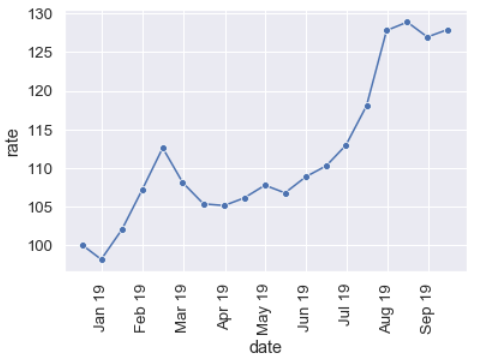
{'date': {0: Timestamp('2019-01-31 00:00:00'),
1: Timestamp('2019-02-28 00:00:00'),
2: Timestamp('2019-03-31 00:00:00'),
3: Timestamp('2019-04-30 00:00:00'),
4: Timestamp('2019-05-31 00:00:00'),
5: Timestamp('2019-06-30 00:00:00'),
6: Timestamp('2019-07-31 00:00:00'),
7: Timestamp('2019-08-31 00:00:00'),
8: Timestamp('2019-09-30 00:00:00'),
9: Timestamp('2019-10-31 00:00:00'),
10: Timestamp('2019-11-30 00:00:00'),
11: Timestamp('2019-12-31 00:00:00'),
12: Timestamp('2020-01-31 00:00:00'),
13: Timestamp('2020-02-29 00:00:00'),
14: Timestamp('2020-03-31 00:00:00'),
15: Timestamp('2020-04-30 00:00:00'),
16: Timestamp('2020-05-31 00:00:00'),
17: Timestamp('2020-06-30 00:00:00'),
18: Timestamp('2020-07-31 00:00:00')},
'rate': {0: 100.0,
1: 98.1580633244672,
2: 102.03029115707123,
3: 107.12429902683576,
4: 112.60187555657997,
5: 108.10306860500229,
6: 105.35473845070196,
7: 105.13286204895526,
8: 106.11760178061557,
9: 107.76819930852,
1回答
-
胡说叔叔
from pandas import Timestampimport pandas as pdimport seaborn as snsimport matplotlib.pyplot as pltdf = pd.DataFrame( {'date': {0: Timestamp('2019-10-31 00:00:00'), 1: Timestamp('2019-11-30 00:00:00'), 2: Timestamp('2019-12-31 00:00:00'), 3: Timestamp('2020-01-31 00:00:00'), 4: Timestamp('2020-02-29 00:00:00'), 5: Timestamp('2020-03-31 00:00:00'), 6: Timestamp('2020-04-30 00:00:00'), 7: Timestamp('2020-05-31 00:00:00'), 8: Timestamp('2020-06-30 00:00:00'), 9: Timestamp('2020-07-31 00:00:00'), 10: Timestamp('2020-08-31 00:00:00')}, 'rate': {0: 100.0, 1: 99.04595078851037, 2: 101.09797599729458, 3: 102.29581878702609, 4: 104.72409825791058, 5: 109.45297539163114, 6: 118.24943699089361, 7: 119.65432196709045, 8: 117.82108184647535, 9: 118.6223497519237, 10: 120.32838345607335}})df['datelabel'] = df['date'].apply(lambda x: x.strftime('%b %d'))chart = sns.lineplot('date', 'rate', data=df,marker="o")chart.set_xticklabels(df.datelabel, rotation=45)plt.show()这是一种方法:构建一个 lambda 函数,将 strftime 与我们的目标表示应用于日期中的每条记录。%b - 月份作为区域设置的缩写名称。%d - 月份中的第几天,以零填充的十进制数字。我们可以将其保存为一组参考标签,通过 xticklabels 应用于图表。此外,您可以使用旋转参数旋转标签。00
相关分类