绘图:如何使用热图制作带注释的混淆矩阵?
我喜欢使用 Plotly 来可视化所有内容,我试图通过 Plotly 可视化一个混淆矩阵,这是我的代码:
def plot_confusion_matrix(y_true, y_pred, class_names):
confusion_matrix = metrics.confusion_matrix(y_true, y_pred)
confusion_matrix = confusion_matrix.astype(int)
layout = {
"title": "Confusion Matrix",
"xaxis": {"title": "Predicted value"},
"yaxis": {"title": "Real value"}
}
fig = go.Figure(data=go.Heatmap(z=confusion_matrix,
x=class_names,
y=class_names,
hoverongaps=False),
layout=layout)
fig.show()
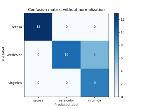
结果是
如何在相应的单元格中显示数字,而不是像这样悬停
浏览 511回答 3
3回答
-
烙印99
您可以使用带注释的热图来获得以下内容:ff.create_annotated_heatmap()完整代码:import plotly.figure_factory as ffz = [[0.1, 0.3, 0.5, 0.2], [1.0, 0.8, 0.6, 0.1], [0.1, 0.3, 0.6, 0.9], [0.6, 0.4, 0.2, 0.2]]x = ['healthy', 'multiple diseases', 'rust', 'scab']y = ['healthy', 'multiple diseases', 'rust', 'scab']# change each element of z to type string for annotationsz_text = [[str(y) for y in x] for x in z]# set up figure fig = ff.create_annotated_heatmap(z, x=x, y=y, annotation_text=z_text, colorscale='Viridis')# add titlefig.update_layout(title_text='<i><b>Confusion matrix</b></i>', #xaxis = dict(title='x'), #yaxis = dict(title='x') )# add custom xaxis titlefig.add_annotation(dict(font=dict(color="black",size=14), x=0.5, y=-0.15, showarrow=False, text="Predicted value", xref="paper", yref="paper"))# add custom yaxis titlefig.add_annotation(dict(font=dict(color="black",size=14), x=-0.35, y=0.5, showarrow=False, text="Real value", textangle=-90, xref="paper", yref="paper"))# adjust margins to make room for yaxis titlefig.update_layout(margin=dict(t=50, l=200))# add colorbarfig['data'][0]['showscale'] = Truefig.show()00 -
慕的地8271018
我发现@vestland的策略是最有用的。但是,与传统的混淆矩阵不同,正确的模型预测是沿着右上角线,而不是左上角。这可以通过反转混淆矩阵的所有索引值来轻松修复,如下所示:import plotly.figure_factory as ffz = [[0.1, 0.3, 0.5, 0.2], [1.0, 0.8, 0.6, 0.1], [0.1, 0.3, 0.6, 0.9], [0.6, 0.4, 0.2, 0.2]]# invert z idx valuesz = z[::-1]x = ['healthy', 'multiple diseases', 'rust', 'scab']y = x[::-1].copy() # invert idx values of x# change each element of z to type string for annotationsz_text = [[str(y) for y in x] for x in z]# set up figure fig = ff.create_annotated_heatmap(z, x=x, y=y, annotation_text=z_text, colorscale='Viridis')# add titlefig.update_layout(title_text='<i><b>Confusion matrix</b></i>', #xaxis = dict(title='x'), #yaxis = dict(title='x') )# add custom xaxis titlefig.add_annotation(dict(font=dict(color="black",size=14), x=0.5, y=-0.15, showarrow=False, text="Predicted value", xref="paper", yref="paper"))# add custom yaxis titlefig.add_annotation(dict(font=dict(color="black",size=14), x=-0.35, y=0.5, showarrow=False, text="Real value", textangle=-90, xref="paper", yref="paper"))# adjust margins to make room for yaxis titlefig.update_layout(margin=dict(t=50, l=200))# add colorbarfig['data'][0]['showscale'] = Truefig.show()00 -
倚天杖
正如@vestland所说,你可以用情节注释数字。热图可用作任何类型的绘图。这是一个用于从混淆矩阵(基本上只是一个带有数字的2-d向量)绘制热图的代码。def plot_confusion_matrix(cm, labels, title):# cm : confusion matrix list(list)# labels : name of the data list(str)# title : title for the heatmapdata = go.Heatmap(z=cm, y=labels, x=labels)annotations = []for i, row in enumerate(cm): for j, value in enumerate(row): annotations.append( { "x": labels[i], "y": labels[j], "font": {"color": "white"}, "text": str(value), "xref": "x1", "yref": "y1", "showarrow": False } )layout = { "title": title, "xaxis": {"title": "Predicted value"}, "yaxis": {"title": "Real value"}, "annotations": annotations}fig = go.Figure(data=data, layout=layout)return fig00
相关分类