-

- 小黄鸭htt 2021-07-20
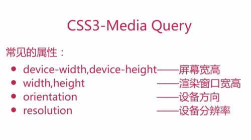
css3 - Media Query
常见的属性:
device-width,device-height -- 屏幕宽高
width,height -- 渲染窗口宽高
orientation -- 设备方向
resolution -- 设备分辨率
- 0赞 · 0采集
-

- 飘渺烟雨 2021-05-07

分辨率改变css的样式
- 0赞 · 0采集
-

- qq_雨燕_2 2021-01-18
CSS3-Media Query:
device-width, device-height 屏幕宽高
width, height: 渲染窗口宽高
orientation 设备方向
resolution 设备分辨率
-
截图0赞 · 0采集
-

- lianhilda 2020-07-17
css3-Media Query
常见的属性:
device-width,device-height---屏幕宽高
width,height---渲染窗口宽高
orientation---设备方向
resolution----设备分辨率
-
截图0赞 · 0采集
-

- RelaxLearning 2020-06-15
@media screen and (min-width:480px){
body{background:blue;}
}
当屏幕大于480 背景变成蓝色
- 0赞 · 0采集
-
- RelaxLearning 2020-06-15
<link type="text/css" rel="stylesheet" href="link.css" media="only screen and (max-width:480px)">外链引入
当屏幕小于480的时候才能引用
- 0赞 · 0采集
-
- 慕婉清7434197 2019-12-09
<link type = "text/css" rel = "stylesheet" href = "link.css" media="only screen and (max-width:480px)"/>
@media screen and (min-with:480px){
body{background:blue;}
}
-
截图0赞 · 0采集
-
- 慕婉清7434197 2019-12-09
media query
-
截图0赞 · 0采集
-

- 慕沐7189869 2019-11-25
外部样式引用格式
<link type="text/css" rel="stylesheet" href="link.css" media="only screen and (max-width:500px)"/>
内部引用格式
@media screen and (max-width:500px) {body{background:red}}
- 0赞 · 0采集
-
- 点点AMY 2019-07-28
css3-Media Query
常见的属性:
device-width,device-height---屏幕宽高
width,height---渲染窗口宽高
orientation---设备方向
resolution----设备分辨率
- 0赞 · 0采集
-

- 緣来 2019-06-25
外链式:
media="only screen and (max-width:480px)"//宽度<480px
内嵌式:
@media screen and (mix-width:480px){ }//宽度>480px-
截图0赞 · 0采集
-

- 为了自己加油 2019-04-10
css3-Media Query
device-width,device-height 屏幕宽高
width,height 渲染窗口宽高
orientation 设备方面
resolution 设备分辨率
- 0赞 · 0采集
-

- donny_leung 2019-02-03
css3-Media Query 常见属性
-
截图0赞 · 0采集
-
- 桑下小园 2018-10-19
device-width,device-height——设备宽高/屏幕宽高/物理宽高
width,height——渲染窗口宽高
orientation——设备方向(横屏,竖屏)
resolution——设备分辨率
随着屏幕宽度(分辨率)变化显示也发生变化,样式设计:
该代码写在变化样式中,当屏幕分辨率<=320px时,执行显示该样式
1、外联样式
<link type="text/css" url="css/two.css" media="only screen and (max-width:320px)"/>
2、内嵌样式
<style>@media screen and (ma-width:500px){/*这里面开始写样式*/}</style>
- 0赞 · 0采集
-

- 我是一枚小白 2018-09-06
Media Query简单案例
-
截图0赞 · 0采集
-

- 慕桂英3645395 2018-08-21
CSS3-Media Query
1.常见属性: device-width,device-height-----屏幕宽高(物理)
width,height -----渲染窗口宽高(浏览器)
orientation -----设备方向(横屏、竖屏)
resolution -----设备分辨率
基本语法:
外联样式
<link type="text/css" rel="stylesheet" href="XXX.css" media="only screen and (max-width:480px)">
当屏幕像素小于480像素时引用css样式
内联样式
<style> @media screen and (min-width:480px){
样式设置
}
- 0赞 · 0采集
-

- 坏脾气闲森 2018-08-19
响应式写法
-
截图0赞 · 0采集
-

- athena_nan 2018-07-09
外部css
-
截图0赞 · 0采集
-
- athena_nan 2018-07-09
css-media Query
-
截图0赞 · 0采集
-

- yxl1074399 2018-06-20
Media Query
-
截图0赞 · 0采集
-

- 慕工程3439996 2018-05-16
-
截图0赞 · 0采集
-

- 慕用4041730 2018-04-10
123
- 0赞 · 0采集
-

- qq_温烫的殷伤_0 2018-04-10
css3-Media Query
常见的属性:device-width,device-height 屏幕宽高
width,height 渲染窗口宽高
orientation 设备方向
resoulution 设备分辨率
- 0赞 · 0采集
-

- 慕丝4089693 2018-04-07
css3-Media Query
-
截图0赞 · 0采集
-

- 糟糠之妻 2018-03-08
- css3-media Query 常见的属性 ·屏幕宽高:device-width 、 device-height ·渲染窗口宽高:width 、 height ·设备方向:orientation ·设备分辨率:resolution
- 0赞 · 0采集
-

- qq_点_5 2018-02-16
- 各种移动设备宽度参数区别
-
截图0赞 · 0采集
-
- orangewangjie3473319 2018-01-26
- media query 的 外联和 内嵌 写法
-
截图0赞 · 0采集
-
- orangewangjie3473319 2018-01-26
- CSS3- Media Query 的常见属性: device-width,device-height,width,height,orientation,resolution
-
截图0赞 · 0采集
-

- 慕工程7047248 2018-01-18
- 响应式
-
截图0赞 · 0采集
-

- Sky羽殇 2018-01-08
- CSS3-Media Query
-
截图0赞 · 0采集


