
transtion与animation为css3新增的属性,主要用来实现一些动画效果
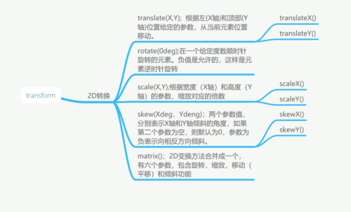
transtion属性向元素应用2D或3D转换,允许我们对元素进行旋转、缩放、移动或倾斜
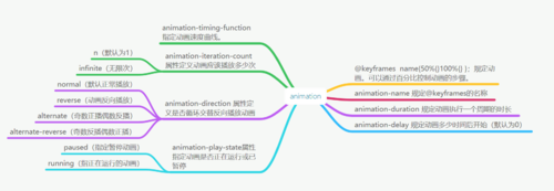
animation动画有三个基本要素:
1、告诉系统需要执行哪个动画。
2、自己创建一个所需的动画
3、告诉系统需要执行动画的时长
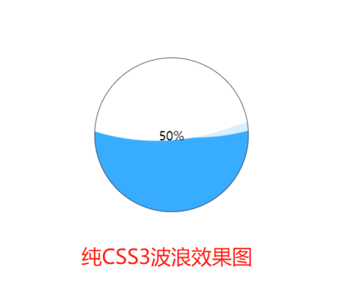
例子:纯CSS3波浪加载效果
以下为效果代码
<title>纯CSS3波浪加载效果</title>
<style>
*{
margin: 0;
padding: 0;
}
.show{
position: absolute;
top: 50%;
left: 50%;
margin-top: -100px;
margin-left: -100px;
width: 200px;
height: 200px;
border-radius: 50%;
background-color: #38ADFF;
overflow: hidden;
z-index: 100;
}
.water{
position: absolute;
left: 50%;
bottom: 50%;
margin-left: -300px;
width: 600px;
height: 600px;
background-color: white;
border-radius: 45%;
transform: rotate(0deg);
animation: roate1 10s infinite;
z-index: -1;
}
.water:nth-of-type(2){
bottom: 48%;
animation: roate1 9s infinite;
background-color: rgba(255,255,255,0.8);
}
.centent{
position: absolute;
width: 200px;
height: 200px;
border-radius: 50%;
border: 1px solid #3F4657;
box-sizing: border-box;
}
.centent>p{
line-height: 200px;
text-align: center;
}
@keyframes roate1 {
50%{
transform:rotate(180deg);
}100%{
transform:rotate(360deg);
}
}
</style>
</head>
<body>
<div class="show">
<div class="water"></div>
<div class="water"></div>
<div class="centent">
<p>50%</p>
</div>
</div>
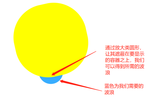
</body>思路分析,我们要实现一个有波浪的加载效果,首先需要制作曲线,再让曲线以波浪的形式滚动起来。曲线可以通过canvas制作,但是那样相对较复杂,在这里我们通过border-radius的方式取巧制作。
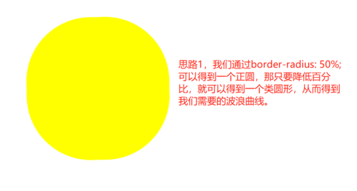
但是得到的类圆形的曲线,如图黄色内部的曲线才是我们想要的
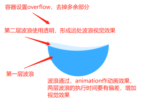
在得到波浪后,将放大的类圆形背景色改为与白色。再新建一个同样的类圆形,通过使用rgba的方式,设置一定的透明的可以形成第二层的远处波浪,增加真实感。
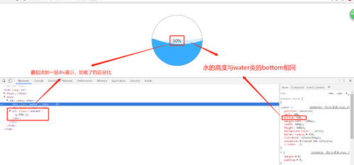
再来只要添加一层用来显示加载进度的div就可以了


 随时随地看视频