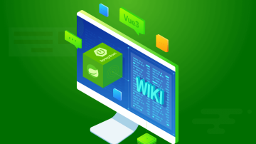

第四篇博客-博客主页.png
一、语义化元素
1.1 HTML5出来之前,我们往往使用div元素来将网页分成一个个大小不一的区域,尽管可以添加class属性、id属性,然后通过在css当中对class属性、id属性添加样式,但是这些div元素并没有实际的意义。
1.2 HTML5的诞生也包括解决这样的问题,HTML5新增加的元素都是对现有的网页和用户习惯进行跟踪、分析和概括而推出的。例如,Google分析了上万的页面,从中分析出了DIV标签的通用ID名称,并且发现其重复量很大,如很多开发人员使用<div class="header"></div>来标记页眉区域,为了解决实际问题,HTML5就直接添加一个<header>标签。
二、为什么要使用语义化元素?
2.1 搜索引擎优化
有利于SEO,和搜索引擎建立良好的沟通,有助于爬虫抓取更多的有效信息,爬虫依赖于标签来确定上下文和各个关键字的权重。
如果你有你的个人博客,就可以通过升级网页为HTML5的方式来提高页面的搜索。
2.2 增强团队协作
便于团队开发和维护,语义化更具可读性,是网页下一步的重要动向,遵循语义化标准,可以减少差异化。
2.3 去掉或者丢失样式的时候能够让页面呈现出清晰的结构。
2.4 方便其他设备解析(如屏幕阅读器,盲人阅读器,移动设备)以意义的方式来渲染网页。
三、常见的语义化元素的用法
常见的语义化元素有:header、footer、section、article、nav、aside、figure、figcaption、hgroup
3.1 section:用于对网站或应用程序中页面中的内容进行分块,通常包括标题、内容。
3.2 header:页面的头部,包括网页的logo,导航等信息等
3.3 footer:页面的底部,包含网页的版权信息等
3.4 nav:页面的导航链接区域,定义页面的主要导航部分。
3.5 article:通常包含头部、内容、底部,它可以是一个博客,报刊中的文章,一篇论坛帖子,一段用户评论
3.6 aside:在article元素之外使用作为页面或站点全局的附属信息部分。最典型的是侧边栏,其中的内容可以是日志串连,其他组的导航,甚至广告,这些内容相关的页面。
3.7 hgroup:当一个区域拥有多个标题时,可以将多个标题都放置于hgroup中。
HTML5代码
<!DOCTYPE html><html><head>
    <title>语义化元素</title>
    <meta charset="utf-8"></head><body>
    <header>
        <nav>
            <ul>
                <li><a href="#">首页</a></li>
                <li><a href="#">关于</a></li>
                <li><a href="#">博客</a></li>
            </ul>
        </nav>
    </header>
    <section>
        <hgroup>
            <h1>标题1</h1>
            <h2>标题2</h2>
            <h3>标题3</h3>
        </hgroup>

        <div class="container">
            <article>
                <h2>Article</h2>
                <p>内容</p>
                <footer>底部</footer>
            </article>
            <aside>
                <h2>Aside</h2>
                <p>内容</p>
            </aside>
        </div>
    </section>
    <section>
        <h1>Section</h1>
        <p>内容</p>
    </section>
    <footer class="footer">底部</footer></body></html>
CSS代码
        body{            padding: 0;            margin: 0;
        }        ul{            padding: 0;            margin: 0;
        }        header{            width: 100%;            height: 60px;            background-color: rgba(0,0,0,0.2);
        }        header nav ul{            padding: 0;            margin: 0;            list-style-type: none;            display: flex;            justify-content: center;
        }        header nav ul:after{            content:"";            display: block;            clear: both;
        }        header nav ul li{            float: left;            line-height: 60px;            margin-right: 20px;
        }        header nav ul li a{            text-decoration: none;            color:#666666;
        }        header nav ul li a:hover{            color:#e67e22;
        }        section{            width: 100%;            margin:0 auto;            background-color: #e8e8e8;            padding:10px 0;            border-bottom: 1px solid #fff;
        }        section h1{            text-align: center;
        }        section h2{            text-align: center;
        }        section h3{            text-align: center;
        }        .container{            width: 1200px;            margin: 0 auto;
        }        .container:after{            display: block;            clear: both;            content: "";
        }        .container article{            width: 740px;            margin-right: 20px;            float: left;            border:1px solid #ffffff;            box-sizing: border-box;            height: 300px;
        }        .container article footer{            text-align: center;            color:#000;            background-color: #e8e8e8;
        }        .container aside{            width: 440px;            float: left;            border:1px solid #ffffff;            box-sizing: border-box;            height: 300px;
        }        section p{            text-align: center;
        }        .footer{            width: 100%;            height: 200px;            text-align: center;            color: #ffffff;            background-color: #000000;
        }
效果:

示例1.png
3.8 figure:figure通常用于包含一张或多张图片、代码、音频、视频等。
3.9 figcaption:figcaption作为figure的描述信息,只能包含一个。
代码:
<figure>    <img src="images/1.jpg">
    <figcaption>
        前端工程师    </figcaption></figure>
四、使用H5新元素搭建个人博客
HTML5
<!DOCTYPE html><html><head> <meta charset="utf-8"> <title>个人博客</title> <link rel="stylesheet" type="text/css" href="styles/index.css"></head><body> <header> <div class="hd_banner"> <div class="hd_container"> <img src="images/hd_logo.png"> </div> </div> </header> <nav> <ul> <li class="checked"><a href="#">首页</a></li> <li><a href="#">技术分享</a></li> <li><a href="#">情感日志</a></li> <li><a href="#">读书笔记</a></li> <li><a href="#">关于我</a></li> </ul> </nav> <section> <div class="container"> <div class="left"> <article> <hgroup> <h1><a href="#">2018-05-21 响应式设计</a></h1> <h3>作者:<a href="#">瑾瑜爱上猫</a> 2018.05.21</h3> </hgroup> <p> 在智能手机还未普及之前,平板电脑之类的终端更没有普及,我们所浏览的网页大多都是通过电脑,所以开发者只需要顾及浏览器上页面的正常显示即可,对于缩放浏览器的尺寸而造成的页面效果显示失常往往也不会在考虑范围之类。移动互联网的诞生,多种移动互联网终端也随即产生,开发者就不得不通过研发新的技术来使得网页在多个终端上显示都有很好的并且正常的效果。也就是说,移动互联网的诞生促进了响应式设计的诞生。 </p> <div class="btn"> <a href="#">阅读全文</a> </div> <footer> <i class="iconfont"></i> </footer> </article> <article> <hgroup> <h1><a href="#">2018-05-22 仿简书的响应式导航栏</a></h1> <h3>作者:<a href="#">瑾瑜爱上猫</a> 2018.05.22</h3> </hgroup> <p> 该区域的内容,因为缩放至一定的宽度,导航列表就不能够正常的显示了,所以就变成下拉菜单的形式,所以要设置下拉菜单的样式,为了提示下拉菜单的存在,事先设置的导航按钮就要由隐藏状态转化为显示状态。 </p> <div class="btn"> <a href="#">阅读全文</a> </div> <footer> <i class="iconfont"></i> </footer> </article> <article> <hgroup> <h1><a href="#">2018-05-23 清除浮动、左边固定右边自适应、水平垂直居中</a></h1> <h3>作者:<a href="#">瑾瑜爱上猫</a> 2018.05.23</h3> </hgroup> <p> 清除浮动、左边宽度固定右边自适应、水平垂直居中这三个知识点是我们经常在开发过程中需要用到的。不但经常用到,而且经常出现在面试题当中,所以对这三者进行知识总结很有必要。 </p> <div class="btn"> <a href="#">阅读全文</a> </div> <footer> <i class="iconfont"></i> </footer> </article> </div> <div class="right"> <aside> <h1>标签</h1> <div class="label"> <a href="#">HTML5</a> <a href="#">CSS3</a> <a href="#">前端</a> <a href="#">HTML5</a> <a href="#">CSS3</a> <a href="#">前端</a> <a href="#">张某某</a> <a href="#">VUE</a> <a href="#">框架</a> <a href="#">前端</a> <a href="#">西北工业大学</a> </div> </aside> </div> </div> </section> <footer></footer></body></html>
CSS3
*{    padding: 0;    margin: 0;
}ul{    list-style-type: none;
}a{    text-decoration: none;
}

@font-face {  font-family: 'iconfont';  src: url('../fonts/iconfont.eot');  src: url('../fonts/iconfont.eot?#iefix') format('embedded-opentype'),  url('../fonts/iconfont.woff') format('woff'),  url('../fonts/iconfont.ttf') format('truetype'),  url('../fonts/iconfont.svg#iconfont') format('svg');
}.iconfont{  font-family:"iconfont" !important;  font-size:16px;font-style:normal;  -webkit-font-smoothing: antialiased;  -webkit-text-stroke-width: 0.2px;  -moz-osx-font-smoothing: grayscale;
}.hd_banner{    width:100%;    padding: 30px 0;    background:url(../images/hd_bg.jpg) no-repeat center;    background-size:cover;
}.hd_container{    width: 970px;    margin: 0 auto;    padding: 30px 0;    text-align: center;
}nav{    width: 100%;    height: 55px;    display: flex;    justify-content: center;
}nav ul:after{    display: none;    clear: both;    content: "";
}nav ul li{    line-height: 55px;    float: left;    padding: 0 20px;
}nav ul li.checked{    border-bottom: 2px solid #e67e22;
}nav ul li a{    text-decoration: none;    color: #505050;    font-size: 14px;
}nav ul li a:hover{    color:#e67e22;
}section{    padding: 40px 0;    background-color: #ebebeb;
}.container{    width: 1200px;    margin: 0 auto;
}.container:after{    content:"";    display: block;    clear: both;
}.container .left{    width: 870px;    float: left;
}.container .left article{    min-height: 300px;    background-color: #ffffff;    margin-bottom: 30px;    padding: 30px 30px;
}article hgroup h1{    text-align: center;    padding: 10px 50px;
}article hgroup h1 a{    color:#303030;    font-size: 1.8em;
}article hgroup h3{    text-align: center;    color:#666666;    font-weight: normal;    font-size: 1em;
}article hgroup h3 a{    color: #e67e22;
}article hgroup h3 a:hover{    text-decoration: underline;
}article p{    padding:30px 0;    font-size: 1.2em;    color:#666666;
}.btn{    padding: 0 0 30px;
}article .btn a{    width: 80px;    height: 40px;    background-color: #e67e22;    text-align: center;    line-height: 40px;    display: block;    color:#ffffff;    transition: 0.5s;
}article .btn a:hover{    background-color: #000;    transition: 0.5s;
}article footer{    height:200;    border-top:1px solid #e8e8e8;    padding:20px 0px 0px;
}.container .right{    width: 300px;    min-height: 200px;    float: right;    background-color: #ffffff;
}.right aside{    padding: 15px 30px;
}.right aside h1{    padding: 8px 0;    border-bottom:1px solid #e67e22;
}.right aside .label{    margin-top: 10px;    line-height: 40px;
}.right aside .label a{    color:#888888;    border:1px solid #e8e8e8;    margin-right: 3px;    margin-top: 3px;    padding: 3px 3px;    transition: 0.5s;    white-space:nowrap;
}.right aside .label a:hover{    background-color: #e67e22;    color:#ffffff;    border:1px solid #e67e22;    transition: 0.5s;
}
效果如最上面的图片显示,通过自己动手搭建整个页面,收获还是蛮大的,希望大家也能够自己动手试试
作者:瑾瑜爱上猫
链接:https://www.jianshu.com/p/2d859d388a06
 随时随地看视频