
目录
一、iris数据集介绍
二、一维数据可视化
三、二维数据可视化
四、多维数据可视化
五、参考资料
一、iris数据集介绍
iris数据集有150个观测值和5个变量,分别是sepal length、sepal width、petal length、petal width、species,其中species有3个取值:setosa、virginica、versicolor,反正就是鸾尾花的3个不同品种吧,各有50个观测值。具体见下表。
import numpy as npimport pandas as pdimport matplotlib.pyplot as pltimport seaborn as sns

%matplotlib inline
sns.set(style="white", color_codes=True)#加载iris数据集from sklearn.datasets import load_iris
iris_data = load_iris()
iris = pd.DataFrame(iris_data['data'], columns=iris_data['feature_names'])
iris = pd.merge(iris, pd.DataFrame(iris_data['target'], columns=['species']), left_index=True, right_index=True)
labels = dict(zip([0,1,2], iris_data['target_names']))
iris['species'] = iris['species'].apply(lambda x: labels[x])
iris.head()
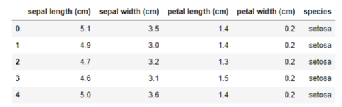
iris data.png
我们以iris数据集为例,演示如何使用matplotlib、seaborn、pandas、sklearn进行一维、二维及多维数据可视化,进行探索性数据分析,为后期建模提供一些思路。
二、一维数据可视化
Seaborn是Python基于matplotlib的数据可视化工具。它提供了很多高层封装的函数,帮助数据分析人员快速绘制美观的数据图形,而避免了许多额外的参数配置问题。
用boxplot画出单个特征与species的关系,可以看到不同品种的鸾尾花在petal length单个维度上已经可以较好地划分出来,尤其setosa的petal length跟另外两个品种的petal length差别不要太大好吗,一眼就把你给认出来了。
# look at an individual feature in Seaborn through a boxplotsns.boxplot(x='species', y='petal length (cm)', data=iris)
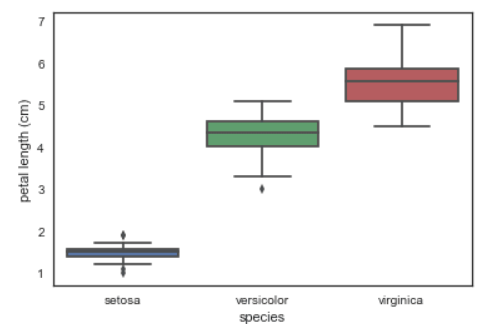
box plot
kdeplot核密度图
# kdeplot looking at univariate relations# creates and visualizes a kernel density estimate of the underlying featuresns.FacetGrid(iris, hue='species',size=6) \
   .map(sns.kdeplot, 'petal length (cm)') \
    .add_legend()

kdeplot
violinplot琴形图:结合了箱线图与核密度估计图的特点,它表征了在一个或多个分类变量情况下,连续变量数据的分布并进行了比较,它是一种观察多个数据分布有效方法。
# A violin plot combines the benefits of the boxplot and kdeplot # Denser regions of the data are fatter, and sparser thiner in a violin plotsns.violinplot(x='species', y='petal length (cm)', data=iris, size=6)
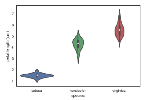
violin plot
三、二维数据可视化
散点图:用FacetGrid按照品种标识颜色,便于我们寻找数据间的关系,这里使用了两个特征进行可视化,setosa还是一如既往的好认,virginica跟versicolor还是显得有些难舍难分。
# use seaborn's FacetGrid to color the scatterplot by speciessns.FacetGrid(iris, hue="species", size=5) \
    .map(plt.scatter, "sepal length (cm)", "sepal width (cm)") \
    .add_legend()
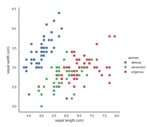
scatter plot by species
pairplot:展现特征的两两关系,简直太棒了好吧!
# pairplot shows the bivariate relation between each pair of features# From the pairplot, we'll see that the Iris-setosa species is separataed from the other two across all feature combinations# The diagonal elements in a pairplot show the histogram by default# We can update these elements to show other things, such as a kdesns.pairplot(iris, hue='species', size=3, diag_kind='kde')
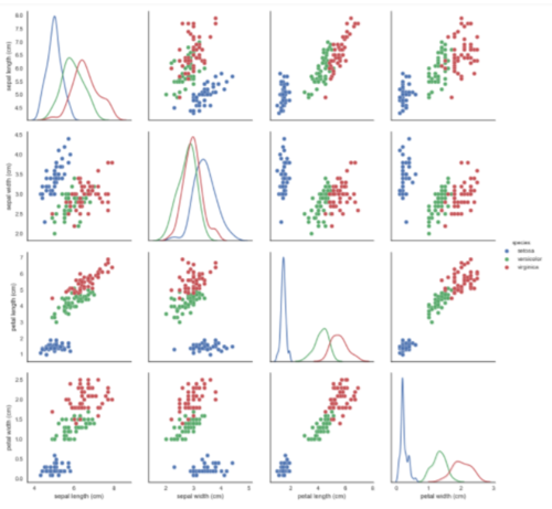
pairplot
四、多维数据可视化
这里多维数据可视化不会用到seaborn,主要用到的是pandas、matplotlib和sklearn。
1. Andrews曲线
Andrews曲线将每个样本的属性值转化为傅里叶序列的系数来创建曲线。通过将每一类曲线标成不同颜色可以可视化聚类数据,属于相同类别的样本的曲线通常更加接近并构成了更大的结构。
# Andrews Curves involve using attributes of samples as coefficients for Fourier series and then plotting thesepd.plotting.andrews_curves(iris, 'species')
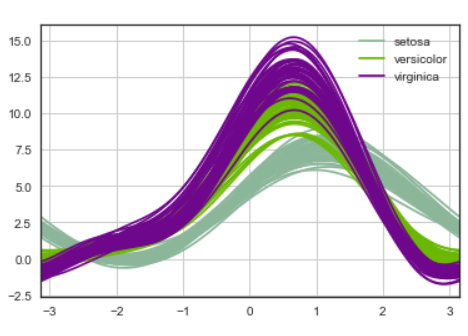
andrews curves
2. 平行坐标
平行坐标也是一种多维可视化技术。它可以看到数据中的类别以及从视觉上估计其他的统计量。使用平行坐标时,每个点用线段联接。每个垂直的线代表一个属性。一组联接的线段表示一个数据点。可能是一类的数据点会更加接近。
# Parallel coordinates plots each feature on a separate column & then draws lines connecting the features for each data samplepd.plotting.parallel_coordinates(iris, 'species')
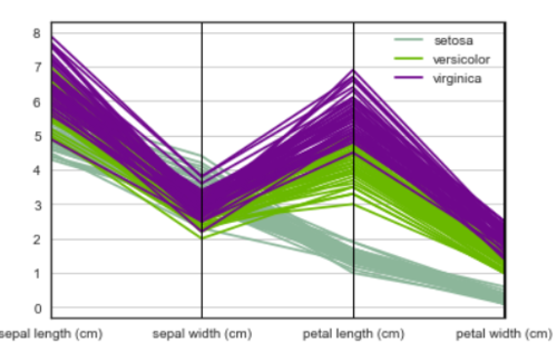
parallel coordinates
3. RadViz雷达图
RadViz是一种可视化多维数据的方式。它基于基本的弹簧压力最小化算法(在复杂网络分析中也会经常应用)。简单来说,将一组点放在一个平面上,每一个点代表一个属性,我们案例中有四个点,被放在一个单位圆上,接下来你可以设想每个数据集通过一个弹簧联接到每个点上,弹力和他们属性值成正比(属性值已经标准化),数据集在平面上的位置是弹簧的均衡位置。不同类的样本用不同颜色表示。
# radviz puts each feature as a point on a 2D plane, and then simulates# having each sample attached to those points through a spring weighted by the relative value for that featurepd.plotting.radviz(iris, 'species')
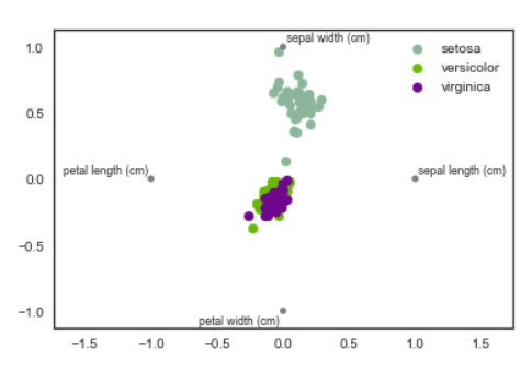
radviz
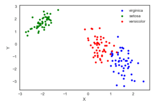
4. 因子分析(FactorAnalysis)
因子分析是指研究从变量群中提取共性因子的统计技术。最早由英国心理学家C.E.斯皮尔曼提出。他发现学生的各科成绩之间存在着一定的相关性,一科成绩好的学生,往往其他各科成绩也比较好,从而推想是否存在某些潜在的共性因子,或称某些一般智力条件影响着学生的学习成绩。因子分析可在许多变量中找出隐藏的具有代表性的因子。将相同本质的变量归入一个因子,可减少变量的数目,还可检验变量间关系的假设。
基于高斯潜在变量的一个简单线性模型,假设每一个观察值都是由低维的潜在变量加正态噪音构成。
from sklearn import decomposition

fa = decomposition.FactorAnalysis(n_components=2)

X = fa.fit_transform(iris.iloc[:,:-1].values)

pos=pd.DataFrame()
pos['X'] =X[:, 0]
pos['Y'] =X[:, 1]
pos['species'] = iris['species']

ax = pos[pos['species']=='virginica'].plot(kind='scatter', x='X', y='Y', color='blue', label='virginica')
pos[pos['species']=='setosa'].plot(kind='scatter', x='X', y='Y', color='green', label='setosa', ax=ax)
pos[pos['species']=='versicolor'].plot(kind='scatter', x='X', y='Y', color='red', label='versicolor', ax=ax)
fa
5.主成分分析(PCA)
主成分分析是由因子分析进化而来的一种降维的方法,通过正交变换将原始特征转换为线性独立的特征,转换后得到的特征被称为主成分。主成分分析可以将原始维度降维到n个维度,有一个特例情况,就是通过主成分分析将维度降低为2维,这样的话,就可以将多维数据转换为平面中的点,来达到多维数据可视化的目的。
from sklearn import decomposition

pca = decomposition.PCA(n_components=2)

X = pca.fit_transform(iris.iloc[:,:-1].values)

pos=pd.DataFrame()
pos['X'] =X[:, 0]
pos['Y'] =X[:, 1]
pos['species'] = iris['species']

ax = pos[pos['species']=='virginica'].plot(kind='scatter', x='X', y='Y', color='blue', label='virginica')
pos[pos['species']=='setosa'].plot(kind='scatter', x='X', y='Y', color='green', label='setosa', ax=ax)
pos[pos['species']=='versicolor'].plot(kind='scatter', x='X', y='Y', color='red', label='versicolor', ax=ax)
pca
需要注意,通过PCA降维实际上是损失了一些信息,我们也可以看一下保留的两个主成分可以解释原始数据的多少。
pca.fit(iris.iloc[:,:-1].values).explained_variance_ratio_
output: array([0.92461621, 0.05301557])
可以看到保留的两个主成分,第一个主成分可以解释原始变异的92.5%,第二个主成分可以解释原始变异的5.3%。也就是说降成两维后仍保留了原始信息的97.8%。
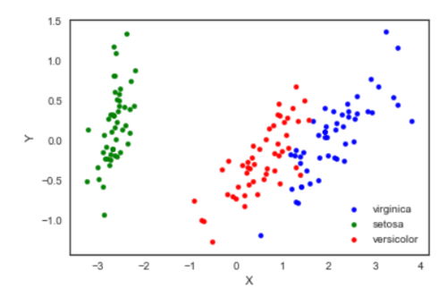
6. 独立成分分析(ICA)
独立成分分析将多源信号拆分成最大可能独立性的子成分,它最初不是用来降维,而是用于拆分重叠的信号。
from sklearn import decomposition

fica = decomposition.FastICA(n_components=2)

X = fica.fit_transform(iris.iloc[:,:-1].values)

pos=pd.DataFrame()
pos['X'] =X[:, 0]
pos['Y'] =X[:, 1]
pos['species'] = iris['species']

ax = pos[pos['species']=='virginica'].plot(kind='scatter', x='X', y='Y', color='blue', label='virginica')
pos[pos['species']=='setosa'].plot(kind='scatter', x='X', y='Y', color='green', label='setosa', ax=ax)
pos[pos['species']=='versicolor'].plot(kind='scatter', x='X', y='Y', color='red', label='versicolor', ax=ax)
ica
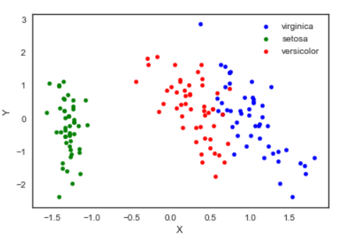
7. 多维度量尺(Multi-dimensional scaling, MDS)
多维量表试图寻找原始高维空间数据的距离的良好低维表征。简单来说,多维度量尺被用于数据的相似性,它试图用几何空间中的距离来建模数据的相似性,直白来说就是用二维空间中的距离来表示高维空间的关系。数据可以是物体之间的相似度、分子之间的交互频率或国家间交易指数。这一点与前面的方法不同,前面的方法的输入都是原始数据,而在多维度量尺的例子中,输入是基于欧式距离的距离矩阵。多维度量尺算法是一个不断迭代的过程,因此,需要使用max_iter来指定最大迭代次数,同时计算的耗时也是上面算法中最大的一个。
from sklearn import manifoldfrom sklearn.metrics import euclidean_distances

similarities = euclidean_distances(iris.iloc[:,:-1].values)
mds = manifold.MDS(n_components=2, max_iter=3000, eps=1e-9, dissimilarity="precomputed", n_jobs=1)
X = mds.fit(similarities).embedding_

pos=pd.DataFrame(X, columns=['X', 'Y'])
pos['species'] = iris['species']

ax = pos[pos['species']=='virginica'].plot(kind='scatter', x='X', y='Y', color='blue', label='virginica')
pos[pos['species']=='setosa'].plot(kind='scatter', x='X', y='Y', color='green', label='setosa', ax=ax)
pos[pos['species']=='versicolor'].plot(kind='scatter', x='X', y='Y', color='red', label='versicolor', ax=ax)
mds
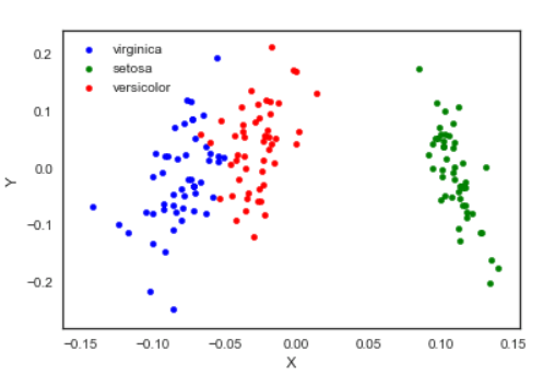
8. TSNE(t-distributed Stochastic Neighbor Embedding)
t-SNE(t分布随机邻域嵌入)是一种用于探索高维数据的非线性降维算法。通过基于具有多个特征的数据点的相似性识别观察到的簇来在数据中找到模式,将多维数据映射到适合于人类观察的两个或多个维度。本质上是一种降维和可视化技术。使用该算法的最佳方法是将其用于探索性数据分析。
from sklearn.manifold import TSNE

iris_embedded = TSNE(n_components=2).fit_transform(iris.iloc[:,:-1])

pos = pd.DataFrame(iris_embedded, columns=['X','Y'])
pos['species'] = iris['species']

ax = pos[pos['species']=='virginica'].plot(kind='scatter', x='X', y='Y', color='blue', label='virgnica')
pos[pos['species']=='setosa'].plot(kind='scatter', x='X', y='Y', color='green', label='setosa', ax=ax)
pos[pos['species']=='versicolor'].plot(kind='scatter', x='X', y='Y', color='red', label='versicolor', ax=ax)
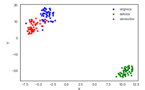
TSNE
嗯,我觉得TSNE的结果最可爱了⁄(⁄ ⁄•⁄ω⁄•⁄ ⁄)⁄
五、参考资料
作者:Littletree_Zou
链接:https://www.jianshu.com/p/3bb2cc453df1