
听闻有人在Twitter上分析股民的情绪来炒股,盈利不少。就来试试看。
具体过程:
一、数据采集
通过采集东方财富上某只股票一段时间内股票的评论,这里以恒生电子为例。我自己编写了爬虫代码。如下:
import re,requests,codecs,time,random
from lxml import html
#proxies={"http" : "123.53.86.133:61234"}
proxies=None
headers = {
'Host': 'guba.eastmoney.com',
'User-Agent': 'Mozilla/5.0 (Windows NT 6.1) AppleWebKit/537.36 (KHTML, like Gecko) Chrome/49.0.2623.221 Safari/537.36 SE 2.X MetaSr 1.0'}
def get_url(page):
stocknum=600570
url='http://guba.eastmoney.com/list,'+str(stocknum)+'_'+str(page)+'.html'
try:
text=requests.get(url,headers=headers,proxies=proxies,timeout=20)
requests.adapters.DEFAULT_RETRIES = 5
s = requests.session()
s.keep_alive = False
text=html.fromstring(text.text)
urls=text.xpath('//div[@id="articlelistnew"]/div[@class="articleh"]/span[3]/a/@href')
except Exception as e:
print(e)
time.sleep(random.random() + random.randint(0, 3))
urls=''
return urls
def get_comments(urls):
for newurl in urls:
newurl1='http://guba.eastmoney.com'+newurl
try:
text1=requests.get(newurl1,headers=headers,proxies=proxies,timeout=20)
requests.adapters.DEFAULT_RETRIES = 5
s = requests.session()
s.keep_alive = False
text1=html.fromstring(text1.text)
times1=text1.xpath('//div[@class="zwli clearfix"]/div[3]/div/div[2]/text()')
times='!'.join(re.sub(re.compile('发表于| '),'',x)[:10] for x in times1).split('!')
#times=list(map(lambda x:re.sub(re.compile('发表于| '),'',x)[:10],times))
comments1=text1.xpath('//div[@class="zwli clearfix"]/div[3]/div/div[3]/text()')
comments='!'.join(w.strip() for w in comments1).split('!')
dic=dict(zip(times,comments))
save_to_file(dic)
except:
print('error!!!!')
time.sleep(random.random()+random.randint(0,3))
#print(dic)
#if times and comments:
#dic.append({'time':times,'comment':comments})
#return dic
def save_to_file(dic):
if dic:
#dic=dic
print(dic)
#df=pd.DataFrame([dic]).T
#df.to_excel('eastnoney.xlsx')
for i,j in dic.items():
output='{}\t{}\n'.format(i,j)
f=codecs.open('eastmoney.xls','a+','utf-8')
f.write(output)
f.close()
for page in range(2,1257):
print('正在爬取第{}页'.format(page))
urls=get_url(page)
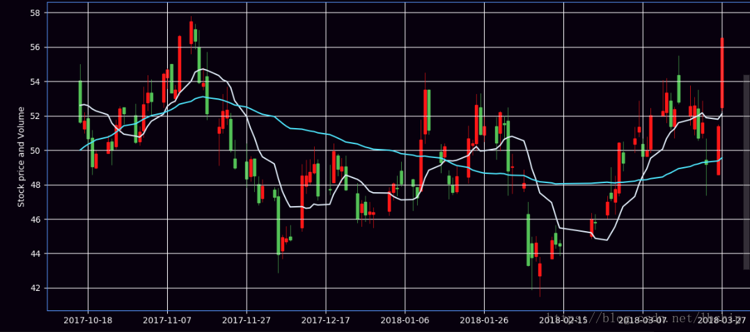
dic=get_comments(urls)我爬取了2017年8月-2018年3月份恒生电子股吧股民个评论,具体如下:

看看大家都在讨论啥,词云的代码可以参考python生成词云,中间一排的绿绿绿绿。看来大家不看好啊。。。。。

接下来是获取对应时间段恒生电子的历史股票数据,我找了很久,终于找了一个不错的接口传送门,直接复制到Excel就可以了。

接下来,用python画出K线图,这部分代码参考了画K线图
from pandas import DataFrame, Series
import pandas as pd; import numpy as np
import matplotlib.pyplot as plt
from matplotlib import dates as mdates
from matplotlib import ticker as mticker
from matplotlib.finance import candlestick_ohlc
from matplotlib.dates import DateFormatter, WeekdayLocator, DayLocator, MONDAY,YEARLY
from matplotlib.dates import MonthLocator,MONTHLY
import datetime
import pylab

MA1 = 10#移动平均线的日期间隔
MA2 = 50
#'股票代码,名称,收盘价,最高价,最低价,开盘价,前收盘,涨跌额,涨跌幅,换手率,成交量,成交金额,总市值,流通市值
startdate = datetime.date(2017,8,1)
enddate = datetime.date(2018, 3, 26)
data=pd.DataFrame(pd.read_excel('eastmoney.xlsx',sheet_name=1,index_col='日期'))#读取数据、设置日期为index
data=data.sort_index()#按日期升序排列
#抽取需要的列组成新的表
stdata=pd.DataFrame({'DateTime':data.index,'Open':data.开盘价,'High':data.最高价,'Close':data.收盘价,'Low':data.最低价})
stdata['DateTime'] = mdates.date2num(stdata['DateTime'].astype(datetime.date))#把日期转化成天数,从公元0年开始算
#stdata=stdata.set_index('DateTime')
#stdata.drop(data.columns[6:],axis=1,inplace=True),stdata['Volume']=data.涨跌幅,del stdata['名称']

def main():
    daysreshape = stdata.reset_index()
    daysreshape = daysreshape.reindex(columns=['DateTime', 'Open', 'High', 'Low', 'Close'])

    Av1 = pd.rolling_mean(daysreshape.Close.values, MA1)
    Av2 = pd.rolling_mean(daysreshape.Close.values, MA2)
    SP = len(daysreshape.DateTime.values[MA2 - 1:])
    fig = plt.figure(facecolor='#07000d', figsize=(15, 10))

    ax1 = plt.subplot2grid((6, 4), (1, 0), rowspan=4, colspan=4, axisbg='#07000d')
    candlestick_ohlc(ax1, daysreshape.values[-SP:], width=.6, colorup='#ff1717', colordown='#53c156')
    Label1 = str(MA1) + ' SMA'
    Label2 = str(MA2) + ' SMA'

    ax1.plot(daysreshape.DateTime.values[-SP:], Av1[-SP:], '#e1edf9', label=Label1, linewidth=1.5)
    ax1.plot(daysreshape.DateTime.values[-SP:], Av2[-SP:], '#4ee6fd', label=Label2, linewidth=1.5)
    ax1.grid(True, color='w')
    ax1.xaxis.set_major_locator(mticker.MaxNLocator(10))
    ax1.xaxis.set_major_formatter(mdates.DateFormatter('%Y-%m-%d'))
    ax1.yaxis.label.set_color("w")
    ax1.spines['bottom'].set_color("#5998ff")
    ax1.spines['top'].set_color("#5998ff")
    ax1.spines['left'].set_color("#5998ff")
    ax1.spines['right'].set_color("#5998ff")
    ax1.tick_params(axis='y', colors='w')
    plt.gca().yaxis.set_major_locator(mticker.MaxNLocator(prune='upper'))
    ax1.tick_params(axis='x', colors='w')
    plt.ylabel('Stock price and Volume')
    plt.show()

if __name__ == "__main__":
    main()
看看运行的效果,好像还挺不错的。
接下来,要对爬下来的股票的评论进行情感分析,这里调用百度AI的情感分析。
import pandas as pd
import datetime
from aip import AipNlp
import codecs

startdate = datetime.date(2017, 8, 1).strftime('%Y-%m-%d')
enddate = datetime.date(2018, 3, 27).strftime('%Y-%m-%d')
APP_ID = '你的id'
API_KEY = '你的key'
SECRET_KEY = '你的key'
client = AipNlp(APP_ID, API_KEY, SECRET_KEY)

def get_sentiments(text,dates):
    try:
        sitems=client.sentimentClassify(text)['items'][0]#情感分析
        positive=sitems['positive_prob']#积极概率
        confidence=sitems['confidence']#置信度
        sentiment=sitems['sentiment']#0表示消极,1表示中性,2表示积极
        #tagitems = client.commentTag(text, {'type': 9})  # 评论观点
        #propertys=tagitems['prop']#属性
        #adj=tagitems['adj']#描述词
        output='{}\t{}\t{}\t{}\n'.format(dates,positive,confidence,sentiment)
        f=codecs.open('sentiment.xls','a+','utf-8')
        f.write(output)
        f.close()
        print('Done')
    except Exception as e:
        print(e)
def get_content():
    data=pd.DataFrame(pd.read_excel('eastmoney.xlsx',sheet_name=0))
    data.columns=['Dates','viewpoints']#重设表头
    data=data.sort_values(by=['Dates'])#按日期排列
    vdata=data[data.Dates>=startdate]#提取对应日期的数据
    newvdata=vdata.groupby('Dates').agg(lambda x:list(x))#按日期分组,把同一天的评论并到一起
    return newvdata

viewdata=get_content()
for i in range(viewdata.shape[0]):
    print('正在处理第{}条,还剩{}条'.format(i,viewdata.shape[0]-1))
    dates=viewdata.index[i]
    for view in viewdata.viewpoints[i]:
        print(view)
        get_sentiments(view,dates)
处理完大概是这样的效果。

接着,我们画出曲线图处理。
import pandas as pd
from datetime import datetime
from pylab import *
import matplotlib.dates as mdates
import dateutil, pylab, random
from pylab import *


import matplotlib.pyplot as plt

data=pd.DataFrame(pd.read_excel('sentiment.xlsx'))
data.columns=['date','positive','confidence','sentiments']
newdata=data.groupby('date').agg(lambda x:list(x))## 相同日期的聚一起

times=[]
sentiment=[]
for i in range(1,newdata.shape[0]):
    p=newdata.positive[i]
    d=newdata.index[i]
    sum=0
    for z in p:
        sum+=z
    average=sum/len(p)
    times.append(d)
    sentiment.append(average)
pylab.plot_date(pylab.date2num(times), sentiment, linestyle='-')
xtext = xlabel('time')
ytext = ylabel('sentiments')
ttext = title('sentiments')
grid(True)
setp(ttext, size='large', color='r')


show()
画出来是这个样子的。

好像看不出来,那么,画一张图看看呢。股票的价格取每天的均价。
import pandas as pd
import matplotlib.pyplot as plt

data1=pd.read_excel('sentiment.xlsx',sheet_name=0)
data1=data1.fillna(method='pad')#因为周末没开盘,所以用周五的价格填充,保证画图连续性
#newdata=pd.merge(data1,data2,how='left',left_on='date',right_on='日期')
x=data1.date
y1=data1.pos
y2=data1.price
fig = plt.figure()
ax1 = fig.add_subplot(111)
ax1.plot(x, y1)
ax1.set_ylabel('sitiment')
ax1.set_title("Sentiment")
ax1.legend(loc='upper right')

ax2 = ax1.twinx()#设置双y轴
ax2.plot(x, y2, 'r')
ax2.set_ylabel('stock price')
ax2.set_xlabel('date')
ax2.legend(loc='upper left')
plt.show()
看得出有轻微的关系,但是没那么明显。
总结一下可能的原因:
1.可能是百度的情感分析不是很准,比如我试了‘今天天气不错,但是我并不开心’,给我积极的概率是0.8,显然不是很正确。
2.采集的评论没有过滤,或者信息量不是很大,需要更新采集数据源。
3.可能真的并没有那么大的关联。


热门评论
-

坚艰真实达2018-11-15 0
查看全部评论写的不错 !good