课程名称:《一天时间迅速准备前端面试 快速构建初级前端知识体系》
章节名称(序号):第3章 CSS 面试题
讲师:双越
章节课程内容:使用flex、定位、响应式布局 相关内容。
学习心得:
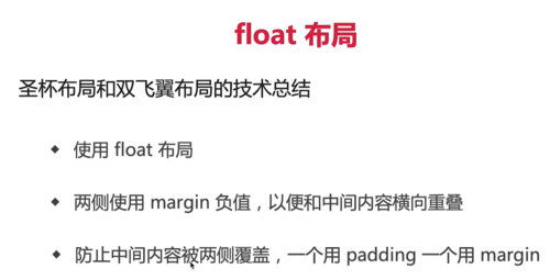
1、课程中的圣杯布局和双飞翼布局使用的float方案,那么用flex 和grid 是否可以实现呢?
flex 只有排序功能,没有调换位置的功能,grid可以调换位置。
用grid 轻松三步搞掂:
grid-template-columns 设置三列左右两侧固定位置,让中间自适应
grid-template-areas 父容器设置每个单元格的命名
grid-area 子容器指定具体单元格
html,
    body {
      padding: 0;
      margin: 0;
    }

    .box {
      background: rgba(0, 0, 0, 0.3);
      width: 100%;
      height: 300px;
      display: grid;
      grid-template-columns: 190px 1fr 190px;
      grid-template-rows: auto;
      grid-template-areas:
        "a1 a2 a3"
    }

    .box div:nth-of-type(1) {
      background: salmon;
      grid-area: a2;
    }

    .box div:nth-of-type(2) {
      background: skyblue;
      grid-area: a1;
    }

    .box div:nth-of-type(3) {
      background: plum;
      grid-area: a3;
    }

    .main {
      height: 200px;
      background: salmon;
      grid-column-start: 1;
      grid-column-end: 1;
    }

    .left {
      height: 200px;
      background: skyblue;

    }

    .right {
      height: 200px;
      background: plum;
    }
<div class="box"> <div> main </div> <div> left </div> <div> right </div> </div>
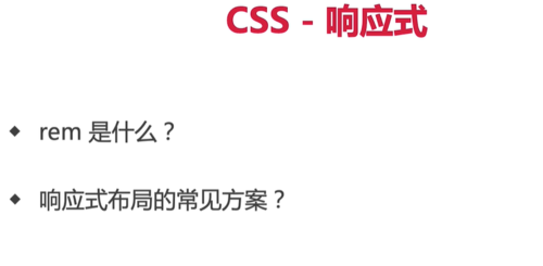
2、移动端rem布局原理解析
要想了解rem 先了解em。1em = 1个font-size
font-size换成了em.那就继续找父元素的font-size,直到根元素的font-size
body{
    font-size:20px;
}
.box{
    font-size:2em; /*2* 20 = 40px*/
    width:100px;
    height:100px;
    background:pink;
    border:2em skyblue solid /* 2*40 = 80px */
}
rem = root +em
html{
font-size:30px;
}
body{
font-size:20px;
}
.box{
width:100px;
height:100px;
background:pink;
border: 2rem skyblue solid; /*和 html 的 font-size有关*/
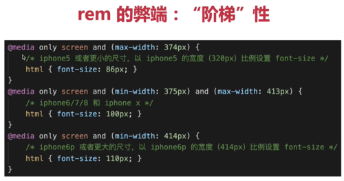
}媒体查询的编写位置及顺序
移动端-> PC端的适配原则:min-width 从小到大
PC端-> 移动端的适配原则:max-width 从大到小
vh,vw
vh 网页视口高度的1/100
vw 网页视口宽度的1/100
vmax 取两者之间最大值,vmin 去两者之间最小值
 随时随地看视频