
还在为上面这样格式各样的商城卡券的样式而发愁?CSS 不熟,canvas 太难,怎么办?
我们来准备一下基础知识
radial-gradient
background: radial-gradient(shape size at position, start-color, ..., last-color);
| 值 | 描述 |
|---|---|
| shape | 确定圆的类型: |
| ellipse (默认): 指定椭圆形的径向渐变。 circle :指定圆形的径向渐变 | |
| size | 定义渐变的大小 |
| position | 定义渐变的位置 |
这样,我们能很容易写出一个居中的圆形背景图
  .center-circle {
    width: 100px;
    height: 100px;
    background: radial-gradient(circle at 50px 50px, transparent 10px, #00adb5 0);
  }
linear-gradient
background: linear-gradient(direction, color-stop1, color-stop2, ...);
| 值 | 描述 |
|---|---|
| direction | 用角度值指定渐变的方向(或角度) |
| color-stop1, color-stop2,… | 用于指定渐变的起止颜色 |
我们不需要知道具体的渐变过程,只要写一个简单的,写一个使用渐变属性而不渐变背景图即可:
  .linear-gradient {
    width: 100px;
    height: 100px;
    background: linear-gradient(to right, #00adb5, #00adb5);
  }
web前端开发学习Q-q-u-n: 767273102 ,分享开发工具,零基础,进阶视频教程,希望新手少走弯路
background
background是可以设置多个图片的,遵循background: [background-color] [background-image] [background-repeat] [background-attachment] [background-position] / [ background-size] [background-origin] [background-clip]; 使用,隔开即可。
开始组合基础知识
写一个最简单的

只要把上述中心圆示例的圆形位置定位在左侧即可
.left-circle{
  width: 100px;
  height: 100px;
  position: relative;
  background: radial-gradient(circle at 0 50px, transparent 10px, #00adb5 0) top left/100px 100% no-repeat;
}
进一步学习

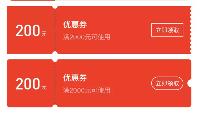
你可还记得 background 是有 repeat 属性吗?也就是说我们只要设置一部分样式,再使用 repeat 即可,看下图片,这不就是一个不渐变的 linear-gradient和 radial-gradient的组合吗,再借助伪类,我们即可写出来了。
.hollow-circles {
  width: 300px;
  height: 100px;
  position: relative;
  background: #00adb5;
  margin-bottom: 10px;
}
.hollow-circles::after {
  content: '';
  position: absolute;
  height: 5px;
  width:100%;
  left: 0;
  bottom: -5px;
  background-image: linear-gradient(to right, #00adb5 5px, transparent 5px, transparent),
  radial-gradient(10px circle at 10px 5px, transparent 5px, #00adb5 5px);
  background-size: 15px 5px;
}
复杂一点

看见很简单,不就是刚才那个圆再画一个吗,但是要考虑到两侧的颜色是不同的,所以我们需要画四个背景图才行,将每个圆定位在方形的各个角落,然后组合在一起即可。
.two-circles {
  width: 300px;
  height: 100px;
  background: radial-gradient(circle at right top, transparent 10px, #00adb5 0) top left / 60px 51% no-repeat,
    radial-gradient(circle at right bottom, transparent 10px, #00adb5 0) bottom left /60px 51% no-repeat,
    radial-gradient(circle at left top, transparent 10px, #eeeeee 0) top right /240px 51% no-repeat,
    radial-gradient(circle at left bottom, transparent 10px, #eeeeee 0) bottom right /240px 51% no-repeat;
}
web前端开发学习Q-q-u-n: 767273102 ,分享开发工具,零基础,进阶视频教程,希望新手少走弯路
写在最后
当我们看到一个新东西时,不要抵触,试着去分析一下,有可能他只是我们以前所学的变体而已,仅仅是对我们已有知识的重新组合和适当改造,当我们搞定了的时候,也许才发现,这也不过如此,然而倘若当初怀着抵触拒绝,却只能是一点进步没有了。
 随时随地看视频