
第一板块:六个案例学会响应式布局,第三章,大谷
第二板块:
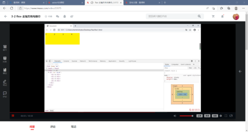
flex-主轴方向与换行
子元素在父元素盒子中的排列顺序:flex-direction:row/row-reverse/column/column-reverse;
子元素在父元素盒子中是否换行:flex-wrap:nowrap/wrap/wrap-reverse;
合并写发:flex-flow:row wrap;(排序,换行);
flex-剩余空间调整为间距
用来存在剩余空间的时候使用,设置为间距的方式:justify-content: flex-start/flex-end/space-around/space-between/center;
flex-交叉轴的对齐方式(我认为是垂直居中)
设置每个flex元素的交叉轴上的默认对齐方式(单行):align-items: flex-start/flex-end/center;
(多行,将单行当作整体对待) :align-center:flex-start/flex-end/center/space-around/space-betwee;
flex-给子元素设置伸缩比例flex属性
设置弹性盒子伸缩基准值:flex-basis;
设置弹性盒子的扩展比率:flex-grow;
设置弹性盒子的缩小比率:flex-shrink;
以上缩写:flex;
flex-给子元素设置伸缩的特殊写法
flex:auto/none/0%/100px/1;
分别为:flex:1 1 auto/0 0 auto/1 1 0%/1 1 100px/1 1 0%
第三板块:
1~3:
<!DOCTYPE html>
<html>
	<head>
		<meta charset="utf-8">
		<style type="text/css">
			#divDom{
				width:1000px;
				background-color: aliceblue;
				display: flex;
				flex-direction: row;/*是否排序*/
				flex-wrap: wrap;/*是否换行*/
				flex-flow:row wrap;/*排序 换行合并写法*/
				justify-content: space-between;/*两端对齐-间距*/
				align-items: center;/*垂直居中单行*/
				align-content: center;/*垂直居中多行*/
			}
			#divDom div{
				width: 300px;
				height: 200px;
				background-color: #9370DB;
				border: 1px solid antiquewhite;
			}
		</style>
	</head>
	<body>
		<div id='divDom'>
			<div>1</div>
			<div>2</div>
		</div>
	</body>
</html>
4~6:
<!DOCTYPE html>
<html>
	<head>
		<meta charset="utf-8">
		<style type="text/css">
			#divDom{
				width:1000px;
				background-color: aliceblue;
			}
			#divDom div{
				width: 300px;
				height: 200px;
				background-color: #9370DB;
				border: 1px solid antiquewhite;
				flex-basis: 50px;/*设置基准值后width就会不起作用*/
				flex-grow: 1;/*当width不能撑满容器的时候设置*/
				flex-shrink: 1;/*当width超出容器的时候设置*/
				flex:1 1 50px;/*合并写法:扩充 缩放 基准值*/
			}

		</style>
	</head>
	<body>
		<div id='divDom'>
			<div>onw</div>
			<div>two</div>
		</div>
	</body>
</html>
第四板块:
 随时随地看视频