课程名称:一课全面掌握主流CSS布局
课程章节:第12章 全屏布局
主讲老师:KingJ
课程内容:
- 全屏布局的概念
- 全屏布局示例代码
- 未讲解到的CSS布局
课程收获:
通过学习掌握了全屏布局,通过代码演示,更加深刻认识到了全屏布局的使用情景。
-
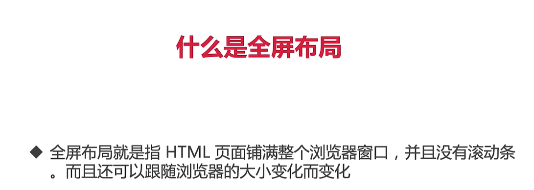
概念
全屏布局就是指HTML页面铺满整个浏览器窗口,并且没有滚动条。而且还可以跟随浏览器的大小变化而变化。 -
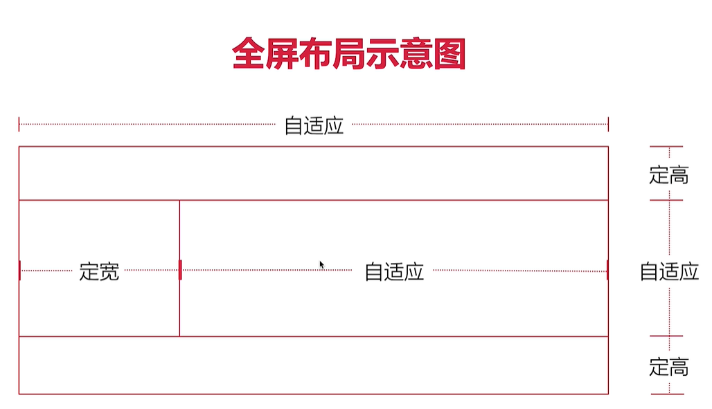
代码示例
<!DOCTYPE html>
<html lang="en">
<head>
    <meta charset="UTF-8">
    <meta http-equiv="X-UA-Compatible" content="IE=edge">
    <meta name="viewport" content="width=device-width, initial-scale=1.0">
    <title>全屏布局</title>
    <style>
    html,body{
        margin: 0;
    }
    header{
        width: 100%;
        height: 100px;
        position: fixed;
        top: 0;
        left: 0;
        right: 0;
        background-color: lightgray;
    }
    .content{
        position: fixed;
        left: 0;
        right: 0;
        top: 100px;
        bottom: 100px;
        background-color: lightblue;
    }
    .content .left{
        width: 300px;
        height: 100%;
        position: fixed;
        left: 0;
        top: 100px;
        bottom: 100px;
        background-color: lightcoral;
    }
    .content .right{
        height: 100px;
        margin-left: 300px;
        background-color: green;
    }
    footer{
        height: 100px;
        position: fixed;
        bottom: 0;
        left: 0;
        right: 0;
        background-color: lightgray;
    }
    </style>
</head>
<body>
<header></header>
<div class="content">
    <div class="left"></div>
    <div class="right"></div>
</div>
<footer></footer>
</body>
</html>
- 未讲解到的CSS布局(自学)
- 网格布局
- 弹性盒子布局
这两种布局需要学习慕课网已有其他课程。
感谢老师的讲解,示例代码实用性非常强,已经在实际开发中用到了,效果非常的赞👍
 随时随地看视频