仅使用一个元素的细长六角形按钮
我想仅使用CSS制作一个类似这样的按钮,而不使用其他元素。
按钮图片
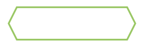
由于按钮带有border附件,因此我认为通常都需要:before和:after元素,以便仅在一侧创建一个箭头。因此,要在每一侧制作一个箭头,我需要span在链接内添加另一个元素。
我尝试的第二种方法是您在下面看到的方法。但是,使用这种解决方案时,它们无法正确居中,并且箭头的每一边的长度都不同。
有解决方案吗?
/* General Button Style */
.button {
display: block;
position: relative;
background: #fff;
width: 300px;
height: 80px;
line-height: 80px;
text-align: center;
font-size: 20px;
text-decoration: none;
text-transform: uppercase;
color: #e04e5e;
margin: 40px auto;
font-family: Helvetica, Arial, sans-serif;
box-sizing: border-box;
}
/* Button Border Style */
.button.border {
border: 4px solid #e04e5e;
}
.button.border:hover {
background: #e04e5e;
color: #fff;
}
/* Button Ribbon-Outset Border Style */
.button.ribbon-outset.border:after,
.button.ribbon-outset.border:before {
top: 50%;
content: " ";
height: 43px;
width: 43px;
position: absolute;
pointer-events: none;
background: #fff;
}
.button.ribbon-outset.border:after {
left: -3px;
margin-top: -40px;
transform-origin: 0 0;
box-sizing: border-box;
border-bottom: 4px solid #e04e5e;
border-left: 4px solid #e04e5e;
transform: rotate(57.5deg) skew(30deg);
}
.button.ribbon-outset.border:before {
right: -46px;
margin-top: -40px;
transform-origin: 0 0;
box-sizing: border-box;
border-top: 4px solid #e04e5e;
border-right: 4px solid #e04e5e;
transform: rotate(57.5deg) skew(30deg);
}
.button.ribbon-outset.border:hover:after {
background: #e04e5e
}
.button.ribbon-outset.border:hover:before {
background: #e04e5e
}
<a href="#" class="button ribbon-outset border">Click me!</a>
 温温酱
温温酱3回答
-

肥皂起泡泡
我自己得到了答案。这是:before和:after元素的transform属性的问题。CSS已更改:/* Button Border Style */.button.border { border-top:4px solid #e04e5e; border-bottom:4px solid #e04e5e;}/* Button Ribbon-Outset Border Style */.button.ribbon-outset.border:after, .button.ribbon-outset.border:before { height: 42px; width: 42px;}.button.ribbon-outset.border:after { left:0; border-bottom:5px solid #e04e5e; border-left:5px solid #e04e5e; transform:rotate(45deg) skew(19deg,19deg);}.button.ribbon-outset.border:before { right:-42px; border-top:5px solid #e04e5e; border-right:5px solid #e04e5e; transform:rotate(45deg) skew(19deg,19deg);}

 随时随地看视频慕课网APP
 Html/CSS
 CSS3
CSS3